
Case Study · Test Automation · Developer Tools
Testsigma — conversion-focused web templates for a test-automation SaaS
Six-month fixed-scope engagement: conversion-focused web templates and marketing pages aligned to the product's visual identity, delivered as wireframes, mockups, and interactive prototypes for a developer audience.
Context
The documented engagement was narrower than a full product redesign: conversion-focused web templates and marketing pages aligned to Testsigma's existing visual identity. I was responsible for assigned design work within that fixed scope; there is no surviving material that supports a broader claim of ownership over the product or the later marketing site.
Design Opportunity
The product itself is technical — automation, CI/CD, cross-browser and cross-device testing — sold to a technical, evaluation-minded audience. Within that, the documented opportunity for this engagement was:
- Communicate a technical product clearly to visitors who evaluate tools by substance, not tone
- Build conversion-focused marketing pages — pages meant to move a visitor toward a trial or demo, not just describe the product
- Design for reuse — web templates, not one-off page layouts, so new marketing pages could be assembled consistently
- Align to the product's existing visual identity, so marketing pages read as part of the same product rather than a separate campaign site
- Move from concept to prototype to delivery within a fixed six-month scope
No specific business problem (a failing metric, a stated conversion goal, a research finding) is documented for this engagement, so none is claimed here — this is the scope as recorded, not a reconstructed brief.
Before
The earlier Testsigma marketing homepage — a single-tone hero built around a green cloud illustration. Broken into the areas actually visible in the archived screenshot:
Header & Hero
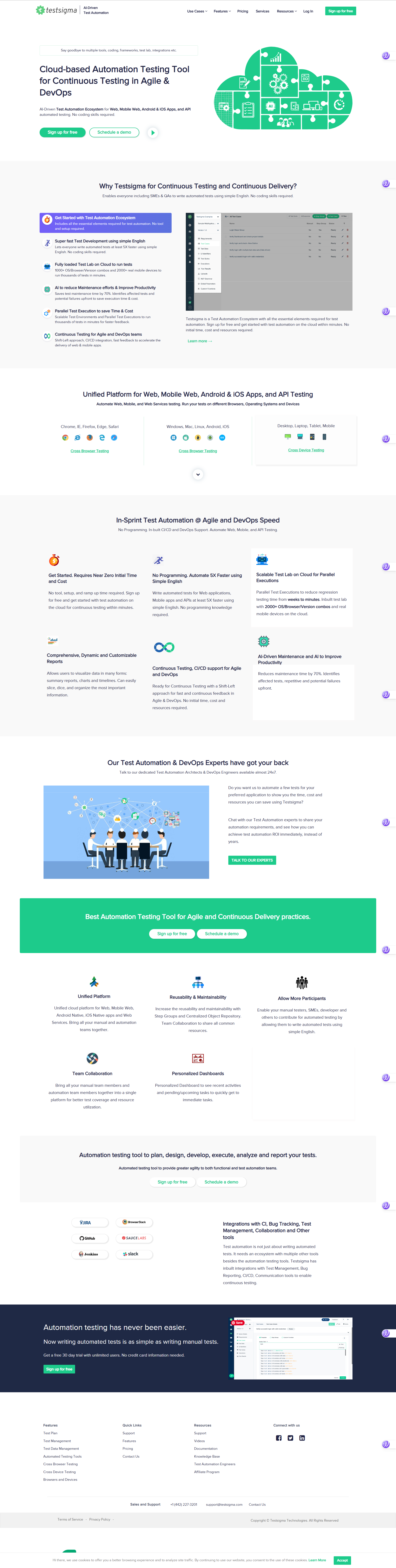
- Navigation — a conventional top bar: logo, Use Cases / Features / Pricing / Services / Resources, Login, and a filled "Sign up for free" button, with no visual connection between nav items and the hero below
- Hero hierarchy — headline and subtext sit on the left; the right side is filled by a decorative green cloud shape containing small device and workflow icons — the illustration signals "cloud product" without showing the product itself
- Headline/illustration relationship — the two don't reference each other directly; the illustration is a category symbol (cloud = SaaS), not an explanation of the headline's claim
- CTA placement — two buttons directly under the subtext ("Sign up for free," "Schedule a demo"), plus a small circular play icon beside them, with no supporting reassurance copy nearby
Main Content
- Capability communication — a "Why Testsigma" block pairs a purple checklist callout with a grey, low-fidelity dashboard mockup image, not an interactive or high-fidelity product view
- Feature blocks — a six-item icon grid ("Get Started," "No Programming," "Fully Loaded Test Lab," etc.), each icon + heading + description, with no accompanying screenshot per item
- Supporting/trust content — enterprise customer logos and two written testimonials appear once, further down the page, rather than being reinforced earlier
Footer
- Structure — four link columns: Features, Quick Links, Resources, and a "Connect with us" column carrying social icons (Facebook, Twitter, LinkedIn)
- Contact treatment — "Sales and Support" phone number and support email sit as their own row, separate from the link columns
- Legal/closing bar — Terms of Service and Privacy Policy on one side, copyright line on the other, in a distinct bottom strip
What I Actually Delivered
The surviving project record gives a clear picture of the deliverables, even though it does not preserve the full design process. These are the parts I can state confidently:
- reusable web templates for conversion-oriented pages;
- wireframes to establish information order before visual execution;
- high-fidelity mockups aligned to the existing Testsigma visual identity;
- interactive prototypes in Sketch and InVision for stakeholder review;
- delivery of assigned design work within the fixed engagement scope.
The surviving evidence does not support a stronger claim about a measured conversion result, so this case study does not claim one.
Information Hierarchy
Reading the current homepage's own section order — the clearest evidence available today of the intended visitor path:
This is read directly from the shipped page structure available today, not from a documented brief — presented as observable design logic, not as a claim about what specifically shipped in 2020.
Design Decision Log
Marketing pages need a consistent structure instead of one-off layouts.
DecisionBuild reusable, conversion-focused web templates ReasoningTemplates were explicitly part of the engagement's documented scope — a repeatable page shell over bespoke, single-use layouts.
Marketing communication has to connect back to the product, not read as a disconnected campaign site.
DecisionAlign page visual direction to Testsigma's existing product identity ReasoningConsistency between marketing pages and the product builds credibility with a technical audience that evaluates the two together.
Stakeholders need to assess a concept before it goes to build, not after.
DecisionValidate every concept as wireframes, mockups, and interactive prototypes before implementation ReasoningCatching structural or content issues at the prototype stage is cheaper than catching them post-build.
A technical, developer-facing audience reads for substance first, not persuasion copy.
DecisionPrioritize clarity and visible product value over decorative marketing treatment ReasoningQAs and engineering teams evaluating an automation tool need the page's substance to be easy to find, not dressed up.
Visible on the current site, not attributed to this engagement specifically: a purely illustrated hero shows category, not capability.
DecisionA product-visible hero communicates capability faster than an abstract illustration ReasoningPairing the value proposition with an actual product-screen mockup lets a technical visitor judge the product before scrolling, instead of relying on category signaling alone.
Note: the first four decisions are grounded in the engagement's documented scope. The fifth is grounded in a visual comparison between the two surviving screenshots — a design-reasoning inference, not a documented historical decision from 2020.
After
The current Testsigma marketing homepage — a lighter, illustration-led hero paired with a real product screen. The same three areas, on the current live site:
Header & Hero

- Navigation — same nav item set (Use Cases, Features, Pricing, Services, Resources), now paired with a small "AI-Driven Test Automation" tagline directly under the logo
- Hero hierarchy — a small eyebrow badge ("Free 30-Day Product Trial") sits above the headline; the reassurance line "No setup required · No credit card information needed" now sits directly under the CTA buttons, closing an objection at the point of decision instead of leaving it unaddressed
- Illustration/product relationship — the hero visual is a real product-screen mockup with a small illustrated figure beside it, placing the product itself in view rather than a category symbol
- CTA placement — same two buttons ("Sign up for free," "Schedule a demo"), now immediately followed by the no-friction reassurance line
Main Content
- Trust presentation — a dedicated full-width gradient banner ("Trusted by happy customers worldwide") with a large usage stat and a customer-logo grid now appears high on the page, not near the bottom
- Feature segmentation — the "Why Testsigma" content is now individually-titled, alternating rows, each pairing a heading/description with its own supporting screenshot or illustration, instead of one continuous six-icon grid
- What stayed the same — the five-icon benefit row ("Unified Platform," "Reusability & Maintainability," etc.) and the integrations/logo section appear essentially unchanged between the two screenshots — not every part of the page was redesigned
Footer
- Structure — the logo and "Sales & Support" contact block (phone, email, "Contact Us") now sit together on the left, integrated with the brand mark, instead of as a separate row below the link columns
- Link columns — Features, Guides, Company, and Quick Links — Guides and Company are new groupings not present in the before footer; Quick Links replaces the before footer's separate Resources column
- Legal/closing bar — copyright and Terms/Privacy remain in the same position and structure as before
Before → After Transformations
Focused on what actually changed, using only what's visible in the two screenshots above.
Transformation 01 — Hero
Before → After: a decorative green-cloud illustration became a real product-screen mockup placed directly in the hero. The visitor now sees the product's interface before reaching the feature sections, instead of inferring "cloud product" from an icon composition. The hierarchy shifted from category-signaling to capability-showing.
Transformation 02 — Content & Feature Structure
Before → After: one continuous six-icon feature grid became individually-titled, alternating rows, each paired with its own screenshot or illustration. Each feature now carries its own visual proof instead of sharing one undifferentiated grid — a visitor can stop at the one feature relevant to them and see it demonstrated, not just described.
Transformation 03 — Trust / Supporting Content
Before → After: customer logos and testimonials moved from near the bottom of the page to a dedicated gradient banner positioned right after the opening section, paired with a large usage stat ("1000000+"). Trust evidence now appears early in the scroll instead of only being reached by visitors who scroll the whole page.
Transformation 04 — Footer
Before → After: contact information moved from a standalone row into the brand block itself, and the link taxonomy changed from Features/Quick Links/Resources/Connect to Features/Guides/Company/Quick Links. The footer reads less like a link dump and more like a structured map of the site's own sections — a small but real information-architecture change, not just a visual refresh.
Constraints & Tradeoffs
- Fixed-scope engagement — six months, defined scope, no ongoing ownership of the site afterward
- Technical/developer audience — pages had to hold up to a skeptical, evaluation-minded reader, not just look polished
- Conversion-focused context — templates had to move a visitor toward a trial or demo, not just communicate
- Reusable web templates — a constraint as much as a deliverable: layouts had to generalize across future pages, not just look right on the pages built during the engagement
- Existing product visual identity — visual direction was bound to an identity that already existed, not a free-standing brand exercise
- Incomplete surviving 2020 documentation — detailed historical research notes, stakeholder decision logs, and performance metrics from the 2020 engagement are not available in the surviving project source, so none are presented here
Outcome
That is the limit of what I can verify from the engagement. No brief, research notes, analytics, or historical decision log from 2020 survive, so I have not reconstructed them from the current site.
Reflection
No business-impact figures from this engagement are available to me now, so none are claimed.
Daily Delivery — Online Grocery Experience