
Case Study · Consumer Product
Daily Delivery — Online Grocery Experience
A complete grocery commerce experience designed end-to-end — from first launch to accepted order — with the checkout, retention, and business logic thought through, not just the screens.
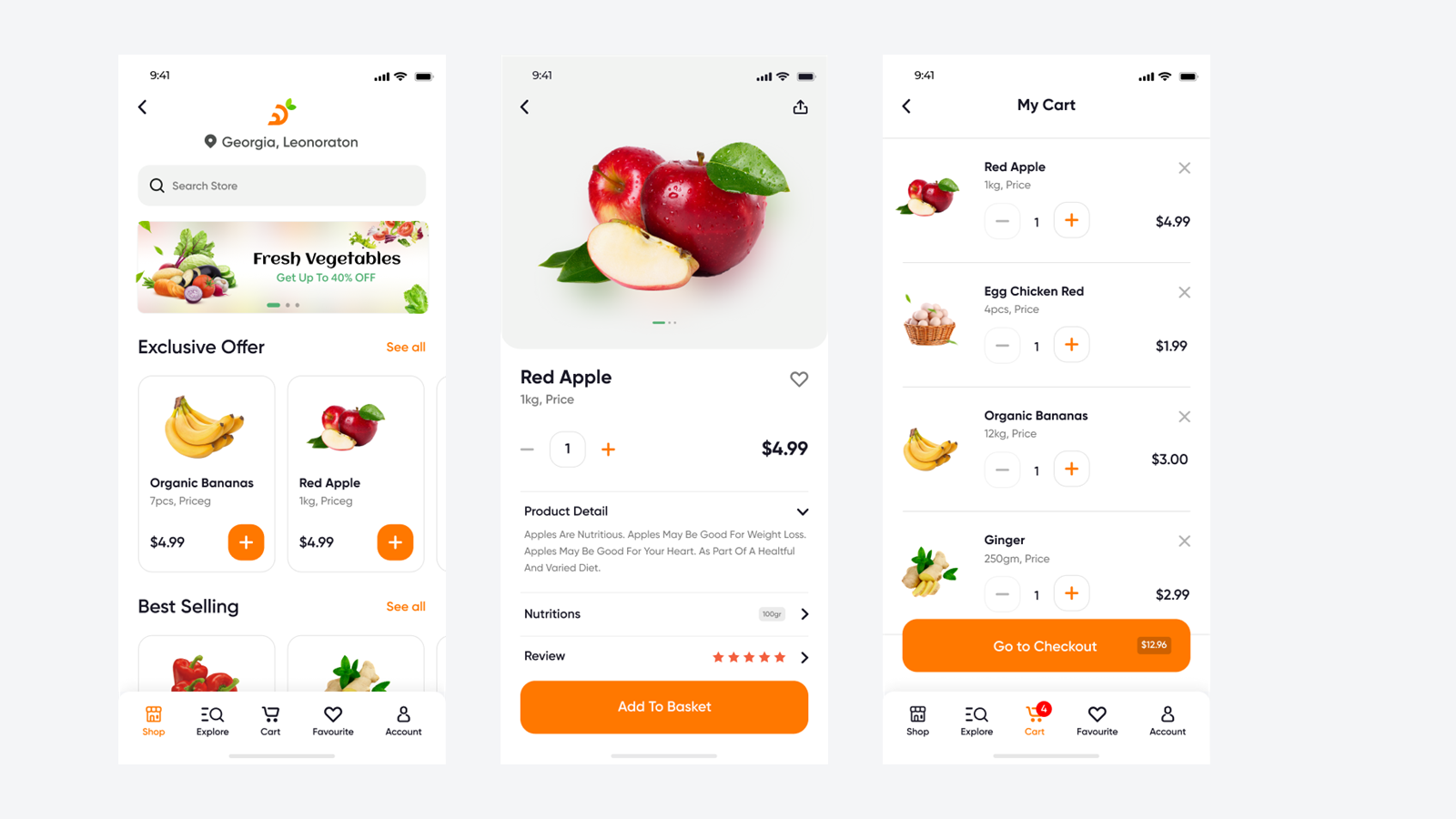
Product Goal & Context
- Product goal — make the weekly grocery shop completable in minutes, one-handed, with zero learning curve — and make the second order faster than the first
- Business goal — protect thin category margins by maximizing order completion and repeat frequency, the two levers that make expensive customer acquisition pay back
- User goal — restock the household without it feeling like a task: find the usual items fast, trust the total, know when it arrives
- Success metrics — order completion rate, 30-day repeat rate, time-to-order for returning customers, checkout abandonment by step
Grocery delivery is a solved category with unforgiving economics: customer acquisition is expensive, margins are thin, and the product wins or loses on those two numbers. Every design decision in this product traces back to one of them.
This is a self-directed product project — my consumer counterweight to a decade of enterprise work. The constraint I set myself: design it as if the unit economics were real, because in this category, a beautiful app that leaks orders at checkout is a failed product.
The Customer Problem
The grocery customer is not browsing — they're restocking a household while tired, hungry, or mid-task. Their problems are specific:
- Repeat need, repeated friction. They buy mostly the same 30 items weekly, yet most grocery apps make every order feel like the first.
- Decision fatigue at scale. Dozens of micro-decisions per order; every unclear label or buried price multiplies the fatigue.
- Trust anxiety at the end. Address, payment, delivery window — the highest-stakes information is requested at the moment patience is lowest.
- One-handed reality. The order happens on a phone, in a hand that's also holding a child, a bag, or a train rail.
The Purchase Journey
The product was designed as a full journey with every state accounted for — splash to accepted order, including errors, verification, and empty states:
The journey's economics are asymmetric: the first half (discovery) determines basket size; the second half (cart → confirmation) determines whether the order happens at all. Design attention was allocated accordingly — discovery got richness, checkout got ruthlessness.
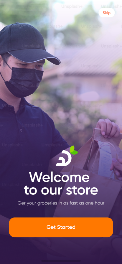
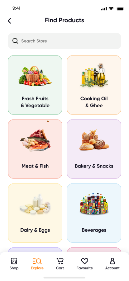
Design Decision Log
Appetite drives grocery purchases, but interface chrome competes with the food.
DecisionGive produce photography the visual budget; keep chrome quiet ReasoningIn this category the product image is the persuasion; everything else is logistics.
OutcomeScreens sell without shouting; hierarchy stays legible at speed.
Accent color everywhere means emphasis nowhere.
DecisionReserve the action color for money moments — add-to-cart and checkout ReasoningThe two taps the business lives on deserve unshared visual weight.
OutcomeThe purchase path is always the most visible path on screen.
Real usage is one-handed; top-of-screen actions are a stretch, literally.
DecisionThumb-zone architecture — primary actions in the bottom half ReasoningOne-handed use is the default context, not the edge case.
OutcomeComplete orders are physically comfortable end to end.
Consumer trust dies in the unhappy paths — errors, verification, empty carts.
DecisionDesign edge states first-class, with the same care as the happy path ReasoningA confusing error at payment costs more than ten beautiful home screens earn.
OutcomeEvery dead end offers a way forward; 20+ screens cover the full state space.
Tradeoffs
Real product design is choosing what loses. The ones that mattered here:
- Basket size vs. checkout speed. Upsell modules in checkout raise average order value — and abandonment. I kept checkout clean and pushed cross-sell upstream into discovery, accepting a smaller basket for a completed one.
- Onboarding data vs. time-to-first-order. Every field collected up front improves personalization later and loses customers now. Only location survives as a pre-shopping requirement — everything else waits until checkout, where the motivation to finish carries the effort.
- Category richness vs. scanning speed. A denser explore grid shows more range per screen; a looser one scans faster one-handed. I sided with scanning speed — in a repeat-purchase product, findability compounds; visual abundance doesn't.
- Brand expressiveness vs. system reuse. Screens could each be more individually expressive; instead a small set of reusable patterns keeps 20+ screens coherent — the enterprise lesson applied to consumer scale.
The Checkout Experience
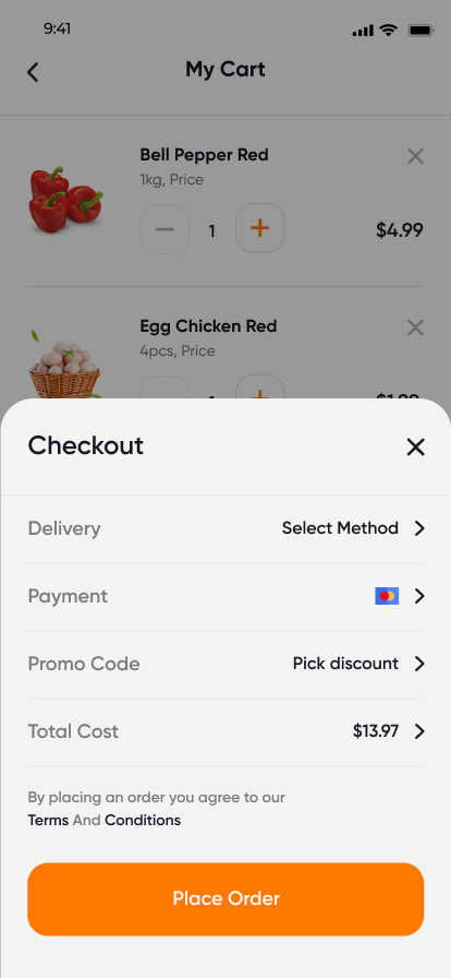
Checkout is where grocery products die, so it got the most deliberate design in the product:
- Progressive disclosure — address, delivery window, and payment revealed as steps, so the form always feels shorter than it is
- No surprises at the end — costs visible in the cart before checkout begins; the final screen confirms, it doesn't reveal
- Trust signals at the anxiety points — payment method clarity and editable order summary exactly where second thoughts happen
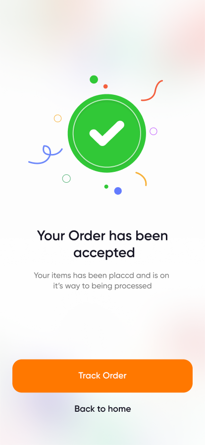
- A designed ending — the order-accepted moment is celebrated calmly; relief, confirmed, without confetti clutter
Edge Cases & Delivery Trust
Groceries are perishable inventory sold against a promise of arrival — which makes the unhappy paths part of the core product, not an appendix. The state space was designed deliberately:
- Out-of-stock behavior — stock issues surface at the item level, before checkout, with a clear choice: substitute or remove. Never a silent swap; a customer who receives an unrequested substitution loses more trust than one asked a question.
- Inventory shifting under the cart — the cart revalidates before payment, so availability changes appear as an editable cart update, not a post-payment apology. The rule: surprises are allowed to cost seconds, never money.
- Order cancellation — cancellable from order status while unfulfilled, with the refund expectation stated at the moment of cancellation. Making cancellation findable is a retention decision: customers who feel trapped don't reorder.
- Delivery trust — the address is confirmed visually at checkout, the delivery window is chosen (not just promised), and the order-accepted screen restates both. Trust in delivery is built at confirmation, not at the doorstep.
- Errors and verification — dedicated error and phone-verification states, written to say what happened and what to do next. In a payment flow, an ambiguous error is indistinguishable from a scam.
Rejected Ideas
- Subscription-first ("never run out") model — rejected for v1: subscriptions monetize a habit the product hasn't earned yet. Favorites-based rapid reorder builds the habit; subscription is the natural v2 on top of proven repeat behavior.
- Checkout upsell modules — rejected (covered in tradeoffs): raising basket size at the moment of highest abandonment risk is borrowing revenue from completed orders.
- Gamified engagement (streaks, points) — rejected: grocery frequency is set by the household's fridge, not by dopamine. Engagement mechanics here read as manipulation and cheapen delivery trust.
- Forced account creation before browsing — rejected: value must precede commitment; the catalog is the pitch. Only location is required to shop, because pricing and availability honestly depend on it.
Metrics I'd Track After Launch
- Completion funnel by step — cart → address → window → payment → confirm, because the step-level drop-off tells you which screen is lying to you
- Time-to-order, first vs. repeat — the product's core promise is that order five is dramatically faster than order one; this is the number that proves it
- Favorites adoption and reorder share — what portion of repeat baskets start from favorites; the retention engine's health gauge
- Substitution acceptance rate — measures whether out-of-stock handling preserves trust or spends it
- 30-day repeat rate — the business outcome everything above serves
Retention Thinking
Grocery is a repeat-purchase business — the first order is acquisition, the fifth order is the product working. The design carries retention mechanics structurally:
- Favorites as the reorder engine — the weekly 30 items become one-tap accessible, converting the repeat shop from a 15-minute task to a 3-minute one
- Search with memory — filters and recent queries assume the returning user, not the first-timer
- Account as a utility, not a profile — addresses, payment methods, and order history organized around "order again faster," which is the only reason a grocery customer opens settings
- Consistent category behavior — every category page works identically, so learned habits transfer; habit is the retention mechanism no notification can substitute
Business Considerations
- The two numbers — every screen was pressure-tested against order completion (does this add friction to finishing?) and repeat frequency (does this make the next order faster?)
- Cost of acquisition respected — onboarding is engineered to lose nobody: value proposition before permissions, sign-in friction minimized, location the only gate
- Margin awareness in the UI — delivery costs and totals stay visible early because surprise fees are the category's #1 stated abandonment reason
- Honest scope — as a self-directed project there are no live conversion numbers to report; the business reasoning above is the framework I'd validate against real funnels in production, and exactly how I evaluate this work in enterprise settings
What Enterprise Work Taught This Product
The disciplines transfer both ways: information hierarchy from dashboard design keeps the home screen scannable; systematic spacing and reusable patterns keep 20+ screens coherent; and "learn once, use everywhere" — the rule that governs enterprise platforms — is precisely what makes a weekly grocery shop feel effortless by the third order.
Design System for Figma Portfolio — Published on Figma Community