
Flagship Case Study · Enterprise Analytics
Pure Insights — Enterprise Analytics Platform
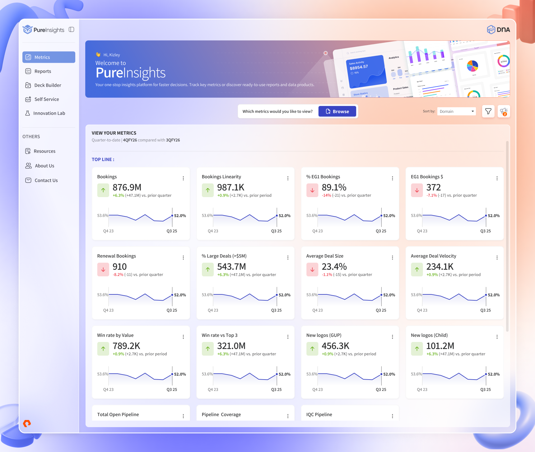
Evolved Pure Insights from a portal-centric reporting experience into a scalable enterprise analytics platform focused on discoverability, performance monitoring, and executive decision making.
Context
Pure Insights is Everpure's analytics platform, used to monitor business performance, bookings, reporting workflows, and operational metrics. I work on it as the Senior Product Designer at Mindteck, Everpure's design and engineering partner on the product.
When I joined the project in late 2024, the experience was heavily portal-oriented: people came to pull reports, and reporting workflows were fragmented across multiple views. The platform worked — but assembling one picture of business performance meant knowing where to look, and increasingly, people didn't.
As the platform evolved, the challenge became creating a cohesive analytics experience: better discoverability, consistent dashboards, and the kind of executive visibility that doesn't require a data team in the loop.
My Role
As the Senior Product Designer on the engagement, I was responsible for defining the design foundations, dashboard frameworks, reporting patterns, and the mobile analytics experience. Concretely, my work covered:
- Design foundations — color, typography, and layout systems the platform inherits by default
- Visual system — applied consistently from brand expression through data-dense product UI
- Dashboard UX — KPI patterns, hierarchy, drill-down behavior, empty and loading states
- Data visualization — chart selection and a categorical palette built for multi-series legibility
- High-fidelity design — the shipped screens across executive, domain, and mobile surfaces
- Prototyping — interactive prototypes used in stakeholder usability reviews, which caught workflow issues before development
Why This Project Matters
This project sits at the intersection of enterprise UX, analytics, data visualization, and design foundations — and its stakes are business stakes, not interface stakes.
The executive reporting problem is a latency problem. When leadership can't read performance directly, every decision routes through the data team: a question becomes a request, a request becomes a queue, and a Tuesday question gets a Friday answer. Meeting preparation becomes report assembly. The cost isn't the reports — it's the days between question and decision, multiplied across every leader, every week.
The discoverability failure compounds silently. When people can't find existing analytics, they don't stop needing answers — they build their own. Shadow spreadsheets appear, analyses get duplicated, and two meetings arrive with two different numbers for the same metric. At that point the platform has lost the thing analytics exists to provide: a shared version of the truth.
Design foundations were the necessary response, not a preference. Every inconsistent dashboard added interpretation cost for users and production cost for the team — and with the platform set to keep growing, per-screen design attention could never scale. Foundations move quality from supervision to structure: new surfaces inherit the type, color, and layout decisions instead of renegotiating them, which is the only economics that survive platform growth.
And dashboards alone were never going to solve it. The platform already had dashboards — adding more would have added more surfaces to not find, each with its own conventions to relearn. The actual problem lived a level below the screens: in the information architecture that determined what could be found, and in the missing foundations that determined whether ten dashboards could behave like one product. That's why this engagement was scoped as foundations + architecture + dashboards, in that order.
Unlike consumer products, the challenge was never engagement — nobody needs persuading to check business performance. The challenge was interpretation at speed and at scale: reading a dense surface in seconds, trusting what it says, and knowing where to go next. That is the problem every decision below serves.
Key Challenges
Challenge 01 — Discoverability
Information was available but not easily discoverable. Users often had to navigate across multiple reporting areas to understand a single performance trend, and usage concentrated on the handful of views people already knew. In practice, a report nobody can find doesn't exist.
Challenge 02 — Consistency
Different reporting views had evolved independently over time, resulting in inconsistent layouts and interaction patterns. Every new dashboard carried a new learning cost, and quality had to be re-earned surface by surface instead of inherited.
Challenge 03 — Executive altitude
Executives needed fast access to high-level performance signals without losing the ability to drill into detail. Those are opposing forces on the same screen — summary-first reading with depth on demand — and resolving that tension is most of what dashboard design actually is.
Challenge 04 — Cross-device hierarchy
The platform needed to work across desktop and mobile while maintaining information hierarchy. The same truths had to hold on a wide monitor during a review and on a phone between meetings — without the mobile version becoming a shrunken copy.
Who Are the Users?
Three groups consume analytics on this platform, and they read the same data at different altitudes. Designing for their differences — instead of an average user who doesn't exist — drove the information architecture.
- Monitor business performance
- Track KPIs against plan
- Identify trends quickly
- Too much information, too little signal
- Difficult discovery
- Limited at-a-glance visibility
- Monitor team and domain performance
- Investigate operational issues
- Track efficiency over time
- Answers spread across multiple views
- Inconsistent workflows per dashboard
- Slow investigation paths
- Explore data deeply
- Validate trends before they're reported up
- Build and share reporting views
- Fragmented reporting experience
- Inconsistent conventions
- Poor discoverability of existing work
The Analytics Discovery Journey
The platform is designed around one repeating loop — from awareness to action. Every surface exists to move a user one step along it:
Two properties of this loop shaped the design. First, the early steps are glances and the late steps are sessions — so summary surfaces optimize for seconds and detail surfaces optimize for depth. Second, users enter the loop at different points depending on role: executives mostly live in the first half, analysts in the second. The platform can't privilege either without failing the other.
Information Architecture Thinking
The reporting experience was reorganized around how people consume analytics, not how reports happened to be produced:
- Three-layer hierarchy — an executive summary layer (cross-domain signals, minimal navigation), domain dashboards (full metric depth for owners like bookings), and a report level for detailed data views, reached through context rather than as dead ends
- Discoverability by intent — entry paths organized around the question a user is carrying ("how are we performing?" vs. "what's happening in bookings?"), not around a report inventory
- KPI visibility as a rule, not a choice — critical signals surface at the top of every layer, so no path through the platform hides the headline numbers
- Consistent navigation patterns — filters, date ranges, export, and drill-down affordances sit in the same place on every dashboard; users learn the platform once, not per-view
- Dashboard consistency as architecture — the standardized KPI block and layout skeleton mean a new domain dashboard is an instance of the system, not a new design problem
Product Strategy — Why Each Piece Exists
Nothing on these screens is decorative. Each major element earns its place by shortening the path from question to decision:
- Summary cards exist because the most frequent questions deserve pre-computed answers. A KPI card is a question answered before it's asked — value, direction, and delta against the comparison that matters — which is why every card carries all three, in that order.
- Drill-down exists because executives trust numbers they can verify. A summary with no path underneath it is an assertion; a summary that opens into its own detail is evidence. Drill-down isn't a power feature — it's what makes the top layer believable.
- Trends exist because a number without trajectory misleads. "Attrition 2%" means nothing until you know it was 0.9% last quarter — so trendlines ride alongside values by default rather than hiding behind a click.
- Comparisons exist because judgment is comparative. Against plan, against last quarter, against last year — the Bookings dashboard's attainment coloring and Y/Y columns encode the comparisons operators actually argue about in reviews.
- Global, persistent filters work this way because slicing is the analyst's primary verb. Theater, segment, product family, and time view sit in one consistent rail, apply across the whole surface, and never reset unexpectedly — re-filtering per widget is how platforms teach users to distrust their own numbers.
- The navigation hierarchy changed because the old structure indexed reports and the new one indexes questions: "how are we performing?" (executive layer) → "what's happening in this domain?" (domain dashboards) → "show me the records" (report level). Navigation is the strategy, made clickable.
Design Decision Log
Executives struggled to identify the metrics that mattered inside dense reporting views.
DecisionSurface critical KPIs above the fold, summary-first ReasoningExecutives decide rather than browse; scanning effort is the tax on every visit.
Considered & rejectedA configurable "build your own dashboard" approach — rejected because it exports the prioritization problem to the user, and executives won't do that work.
OutcomeBusiness signals readable in seconds; drill-down preserved on demand.
Every dashboard presented metrics its own way, multiplying learning cost.
DecisionStandardize the KPI pattern (value · delta · trend) across all surfaces ReasoningIdentical structures make comparison automatic and reduce cognitive load.
Considered & rejectedLetting each domain keep its "optimized" local metric layout — rejected because per-domain optimization is exactly how the inconsistency happened in the first place.
OutcomeA consistent reporting experience — learn once, use everywhere.
Quality had to be re-earned on every new view; consistency depended on review.
DecisionEstablish design foundations before designing screens ReasoningThe platform will outgrow any designer's review queue; consistency must be structural.
Considered & rejectedRedesigning the highest-traffic dashboards first for a fast visible win — rejected because ten beautiful screens on weak foundations would still diverge within a quarter.
OutcomeNew analytics inherit type, color, and layout quality by default.
Multi-series charts became noise at enterprise data density.
DecisionBuild a muted categorical palette; reserve the accent for emphasis ReasoningDistinguishable-but-quiet series colors keep comparisons readable; scarce accent color keeps meaning.
Considered & rejectedA high-saturation palette for "energy" — rejected after seeing it at real data density: with eight series on screen, saturation reads as alarm, not information.
OutcomeCharts legible side-by-side without the carnival effect.
Mobile analytics was a shrunken desktop, unusable at its actual moment of use.
DecisionRe-prioritize mobile around the glance ReasoningThe mobile moment is between meetings — headline performance and exceptions, not tables.
Considered & rejectedA responsive shrink of the desktop dashboards — rejected because pinch-zooming a data table on a phone isn't mobile support, it's mobile theater.
OutcomeGlanceable monitoring on the phone; depth deferred to desktop.
Navigation had grown per-report, making discovery the platform's core failure.
DecisionReorganize entry paths around user intent ReasoningPeople arrive carrying a question, not a report name.
Considered & rejectedSearch as the primary fix for discoverability — kept as a complement, rejected as the fix, because search only helps people who already know what exists.
OutcomeEach role reaches its answer through a path that matches its intent.
Technical Constraints — and How the Design Respected Them
Enterprise analytics design that ignores the data pipeline is fiction. The real constraints are visible in the shipped screens, and each one shaped a design behavior:
- Batch data latency. The platform runs on warehouse refreshes, not live streams — the dashboards themselves carry a "data last updated" timestamp. The design treats freshness as information: the timestamp is surfaced rather than hidden, because an executive acting on Tuesday's number needs to know it's Tuesday's number. Nothing in the UI pretends to be real-time.
- Large datasets. Headcount in the thousands, bookings across regions and product lines — full tables can't be the default render. Summary-first hierarchy isn't only a UX position; it's the performance strategy: aggregate views load light, and heavy detail is fetched when a drill-down asks for it.
- Role-based access. A people-analytics surface is permission-shaped by definition — the executive summary scopes to your team, and what a leader can see follows the org hierarchy. Layouts were designed to stay coherent when sections are absent for a given role, so a restricted view reads as complete, not broken.
- One warehouse, one truth. Metrics resolve to governed warehouse definitions, not per-dashboard calculations. The design reinforces this by never presenting the same metric two ways — the standardized KPI block is also a data-governance instrument.
Collaboration & How Decisions Were Validated
A platform like this isn't designed at a desk and delivered. The working model, by counterpart:
- Product management — priorities came from the roadmap, not from what was interesting to design; foundations work was sequenced against feature delivery so engineering never waited on design theory
- Engineering — feasibility conversations happened at the pattern level before the screen level; specs carried component states and responsive rules, and naming matched what engineers call things in code, which is why handoff generated few questions
- Data stakeholders — metric definitions and comparison logic (what counts as attainment, which period is the baseline) were treated as requirements, not decoration; the design displays definitions the warehouse can actually serve
- Business stakeholders — validation ran on interactive prototypes in structured reviews; walking a leader through "find this quarter's problem" on a clickable prototype caught workflow gaps before development, which is where rework is cheap
- Quality — the state space (empty, loading, error, permission-restricted, extreme values) was designed and documented up front, so testing had a defined target instead of discovering design intent by filing bugs
Design Foundations
Consistency on this platform is structural, not supervised. Instead of policing screens, I set the foundations every screen inherits — which is why the tenth dashboard feels like the first.
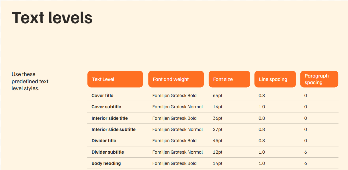
Typography — a documented text-level system
One family (Familjen Grotesk) doing two jobs: display tiers give long reporting contexts unmistakable wayfinding; tight functional tiers (14/12) keep dense screens scannable — headings separate without shouting, body copy holds up inside tables and labels.
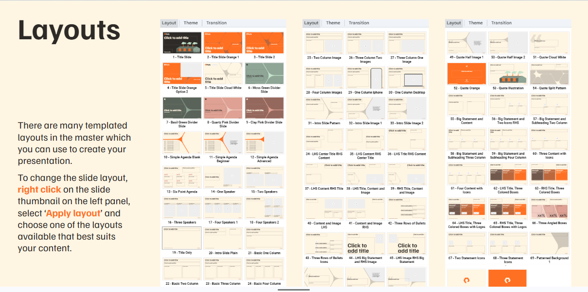
Layout frameworks — one skeleton, many compositions
Every dashboard, report module, and page composes on the same 12-column skeleton. New analytics modules snap into established patterns instead of inventing layouts — that is how a platform absorbs growth without redesign, and why data-heavy modules can sit adjacent without visual collision.
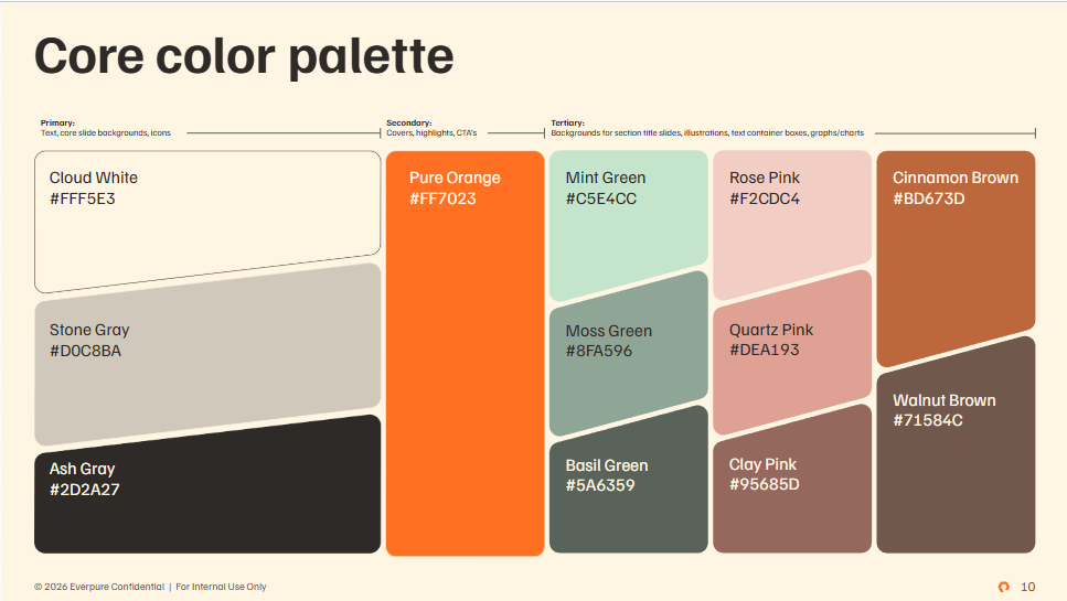
Color — calm canvas, meaningful emphasis
The primary trio is a low-stimulation canvas built for hours-long reporting sessions. Pure Orange is deliberately scarce — reserved for actions and genuine attention moments, so emphasis still means something. The supporting palette is a muted categorical family: distinguishable side-by-side in multi-series charts without the carnival effect saturated palettes create at enterprise density.
The brand carries through an organic connector motif — rounded, fluid forms that counterweight the rigorous grid in dashboards, hero banners, reporting modules, and navigation. The platform feels engineered and owned.
The Executive Dashboard
This surface exists for one job: let a leader answer "how is the organization performing, and where do I need to act?" in under a minute, without a data team in the loop.
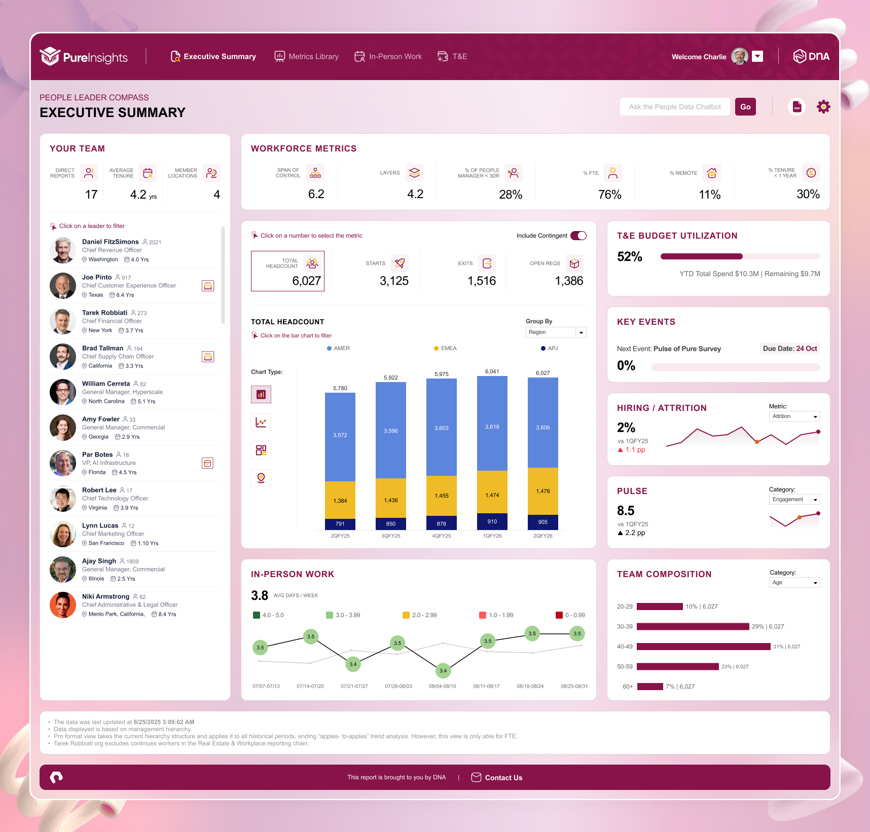
- Decisions it supports — staffing and org-shape calls (span of control, layers, tenure), budget interventions (T&E utilization), and engagement responses (pulse, attrition) — each visible with its trend, not just its number
- Why hierarchy matters — headline KPIs first, trend context second, supporting detail third; an executive reads altitude-first, and the layout matches that reading order exactly
- How information was prioritized — the hardest work was subtraction: what leadership doesn't see by default defines the dashboard as much as what it does
- How KPIs surface — standardized KPI blocks (value, delta, trendline) repeat identically across domains, so comparison is instant and cognitive load stays flat
Bookings Performance Dashboard
Where the executive view answers "how are we doing?", this dashboard answers the operator's question: "where exactly, and why?"
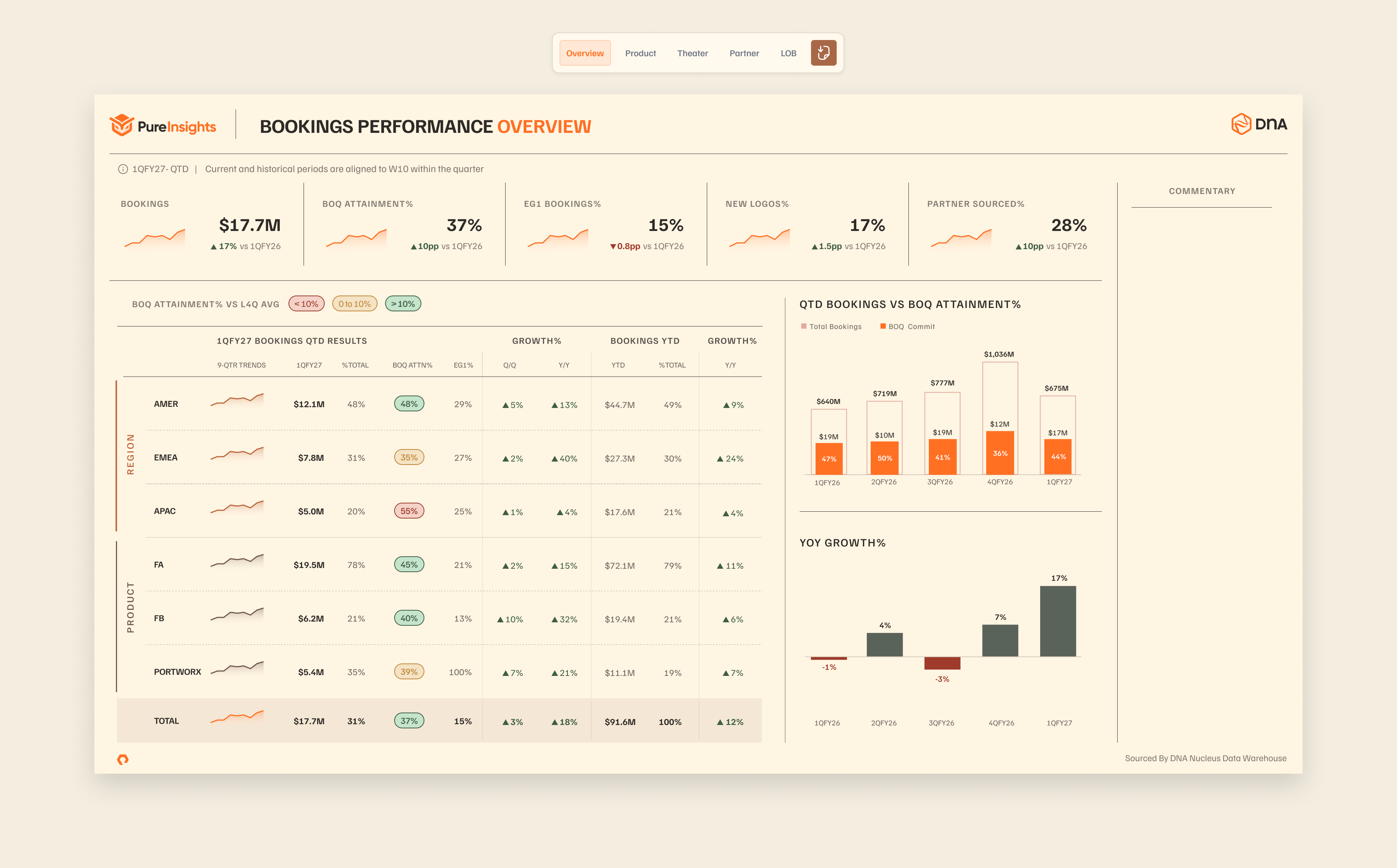
- Why it exists — bookings is a domain with owners who live in this data daily; they need full metric depth, not an executive summary
- Who uses it — revenue and business-line operators tracking bookings, attainment, and growth across regions and products
- Business questions it answers — Which region is behind commit? Which product line is driving growth? Is this quarter's trajectory on plan versus last year? Each chart was chosen for the comparison it answers, not for visual variety
Mobile Experience
Executives don't check performance at a desk — they check it between meetings, in transit, before a board call. Mobile isn't a nice-to-have for this audience; it's where monitoring actually happens.
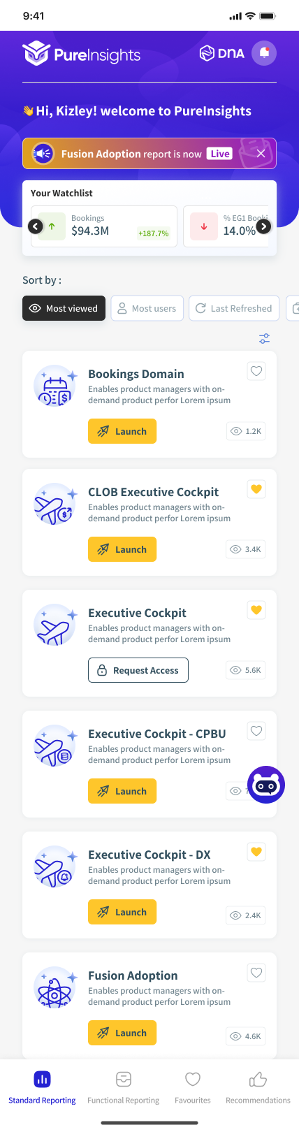
- Optimized for the glance — headline performance and exceptions first; deep tables deferred to larger screens
- Complexity reduced by re-prioritizing — the mobile surface is a different answer to a different moment, not the desktop dashboard compressed
- Tuned for one hand — touch targets and type sizes sized for glanceable monitoring, not study sessions
Impact
- Discoverability improved structurally — analytics organized around user intent, with consistent entry patterns across the platform
- A consistent dashboard experience — standardized KPI, layout, and interaction patterns across every domain view
- Stronger design foundations — documented type, color, and layout systems that new work inherits by default
- Better executive visibility — organizational performance readable at a glance through the summary-first hierarchy
- A scalable reporting framework — the platform absorbs new analytics domains without redesign; the bookings pattern is repeatable for every future domain
Key Learnings
- Designing for executives is subtraction. The hardest and most valuable dashboard work was deciding what leadership doesn't see by default.
- Density and clarity are not opposites. Enterprise users don't want less data — they want data organized by someone who understood their job. Hierarchy, not hiding, is the tool.
- Reusable patterns beat perfect screens. A standardized KPI block used forty times creates more product quality than forty bespoke masterpieces.
- Platforms are IA decisions before UI decisions. The portal-to-platform shift succeeded in the information architecture; the dashboards made it visible.
- Foundations scale even before a formal library exists. Type, color, grid, and shared conventions carried consistency across the platform — and they're the ready substrate for a documented component library as the natural next phase.
Future Opportunities
- Formalize the component library — the foundations are the substrate; documenting them as governed, versioned components is the highest-leverage next investment as the platform and team grow
- From monitoring to alerting — today the user visits the dashboard; the natural evolution is thresholds and subscriptions, so exceptions find their owner instead of waiting to be noticed
- Role-tuned defaults — the IA already separates altitudes; per-role default views (what a CFO sees first vs. a people leader) would compound the discoverability gains
- Instrument the platform itself — an analytics product deserves analytics: which views get used, where drill-downs dead-end, which filters co-occur — the evidence base for the next design cycle
InfraCloud Website Redesign — ~65% conversion lift