
Case Study · Cloud-Native B2B · Engineering Buyers
Redesigning InfraCloud: building technical trust that converted — ~65% lift after launch
Led the end-to-end redesign of InfraCloud's website — rebuilding the information architecture around buyer questions and promoting proof over persuasion. Conversion improved ~65% after launch.
What Was Broken · What Changed · Why It Worked
What was broken
- The sitemap mirrored the org chart, not buyer questions — engineers couldn't map the offering to their problem before losing patience
- The strongest assets (open-source work, engineering blog, real clients) were buried while marketing prose sat up front
- Service pages read as walls of copy; technical readers skimmed and left
- Pages dead-ended — reaching a human required hunting
What changed
- Information architecture rebuilt around the buyer's path: services → expertise proof → open-source credibility → contact
- Proof promoted to first-class content — code, contributions, and case studies before adjectives
- Every service page restructured for scanning: what / how / proof / CTA
- Every page ends with a purposeful next step; generic services became named, productized offerings
- The whole build sat on the reusable component library I maintained, so marketing shipped on-brand pages without a design bottleneck
Why it worked
- Engineering buyers convert on evidence, not persuasion — the redesign moved proof to where the funnel was leaking
- Each step of the evaluation journey (search → homepage → service understanding → validation → contact) answered its question faster than the old site
- Trust compounds: clearer architecture signaled a clearer company, which is exactly what a services buyer is purchasing
Context
InfraCloud is a cloud-native services company — Kubernetes, DevOps, platform engineering, and open-source work for a global engineering audience. I was the lead designer across product and web from 2020 to 2024, a period when the cloud-native ecosystem was the center of gravity for the whole industry.
The gap wasn't the company's expertise — it was real and deep. The gap was a website built like a brochure for a business that is actually evaluated like a hire: buyers wanted to inspect the work, not read about it.
Who the Site Had to Convince
Cloud-native services are bought by engineering organizations — platform engineers, engineering managers, and technical leaders. Three groups, three evaluation styles:
- Technical depth, stated precisely
- Open-source credibility — real code, real contributions
- Architecture expertise they can verify
- Scan for proof, skip the adjectives
- Bounce fast when IA hides answers
- Team enablement — will this partner make my people faster?
- Delivery confidence — evidence of shipped work
- Clear scope for partner evaluation
- Compare against alternatives
- Look for case studies and specifics
- Strategic capability assessment at a glance
- Risk reduction — maturity signals, real clients
- Vendor trust before a single call
- Minutes, not sessions
- Judge the company by how clearly it explains itself
How Technical Buyers Evaluate
The redesign followed the way an engineering buyer actually evaluates a services company. A visitor can arrive from search, land on a service page, inspect a case study, look for technical proof, and decide whether there is enough evidence to start a conversation. The site had to make that sequence easy to follow instead of making visitors reconstruct it themselves.
The weak point was in the middle of that journey. InfraCloud had the expertise, but the old structure made the buyer work too hard to connect an offering to a specific problem and then find proof that the company could solve it. That made information architecture more important than another round of visual polish.
For this audience, proof had to be close to the claim. Open-source work, engineering writing, named client work, technical case studies, and clearly defined services gave visitors something they could inspect. The redesign therefore treated those assets as part of the product experience, not supporting marketing material.
Navigation followed the same logic. A visitor should be able to answer four questions without hunting through the site: What can InfraCloud help with? Have they solved something similar? What evidence supports that? How do I start a conversation? Those questions became the backbone of the information architecture.
The evaluation path
- Find the relevant capability — The visitor needs to understand what InfraCloud can actually help with.
- Check technical fit — Services and technical context need to make the relevance clear without requiring a visitor to decode the company's internal structure.
- Inspect proof — Case studies, open-source work, engineering content, and named client work give the visitor something concrete to verify.
- Decide whether to engage — Once the visitor has enough context and evidence, the next step should be obvious rather than another search through the site.
What Each Pillar Bought the Business
- Information architecture — The sitemap stopped reflecting how the company was organized internally and started reflecting what a buyer needed to know. Services became easier to compare without requiring visitors to understand InfraCloud's internal structure first.
- Proof-first content — Open-source work, engineering content, Botkube, and client work were moved closer to the claims they supported. The material already existed; the design work was making the evidence easier to find at the right moment.
- Reusable page patterns — Service pages followed a consistent what / how / proof / CTA sequence. That gave new offerings a known structure instead of requiring the same information architecture to be solved again.
- Conversion paths — Pages had a clear next step once a visitor had enough context to continue. The intent was not to push a CTA everywhere; it was to remove the dead ends that interrupted an otherwise complete evaluation.
- Performance — The visual system was kept deliberately light. On an information-heavy site for a technical audience, visual weight should support the content rather than compete with it.
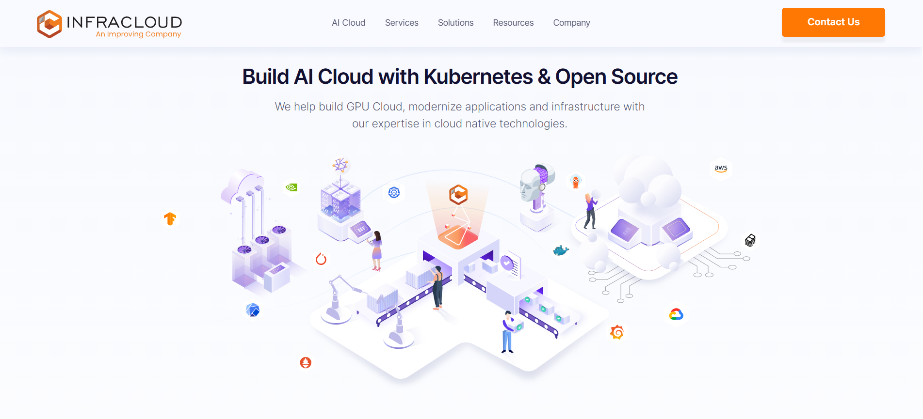
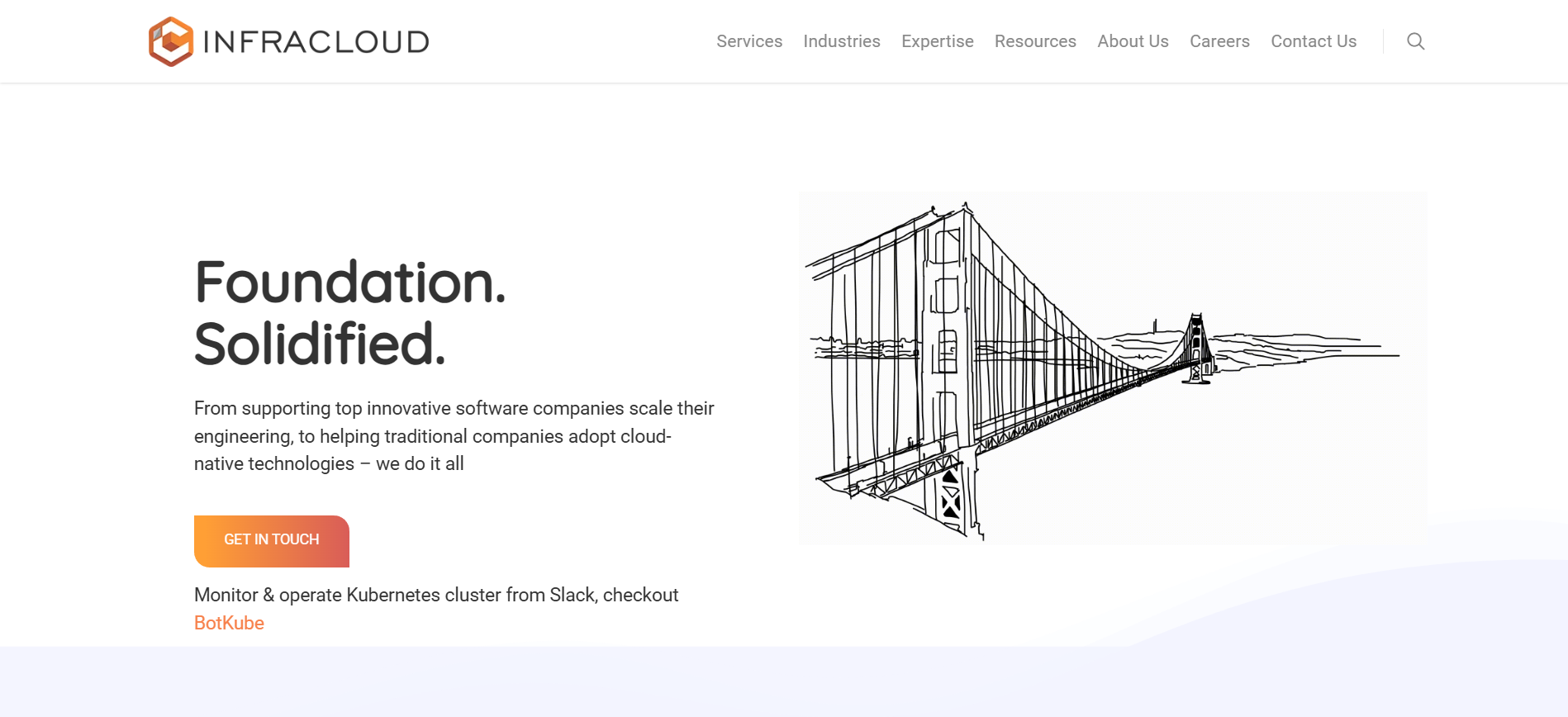
Homepage Transformation
The homepage carried the repositioning: from a generic services site to a clearly structured technology partner. Desktop views, before and after:
Footer Transformation
A footer is a company's information architecture in miniature — it shows exactly how the business thinks about itself:
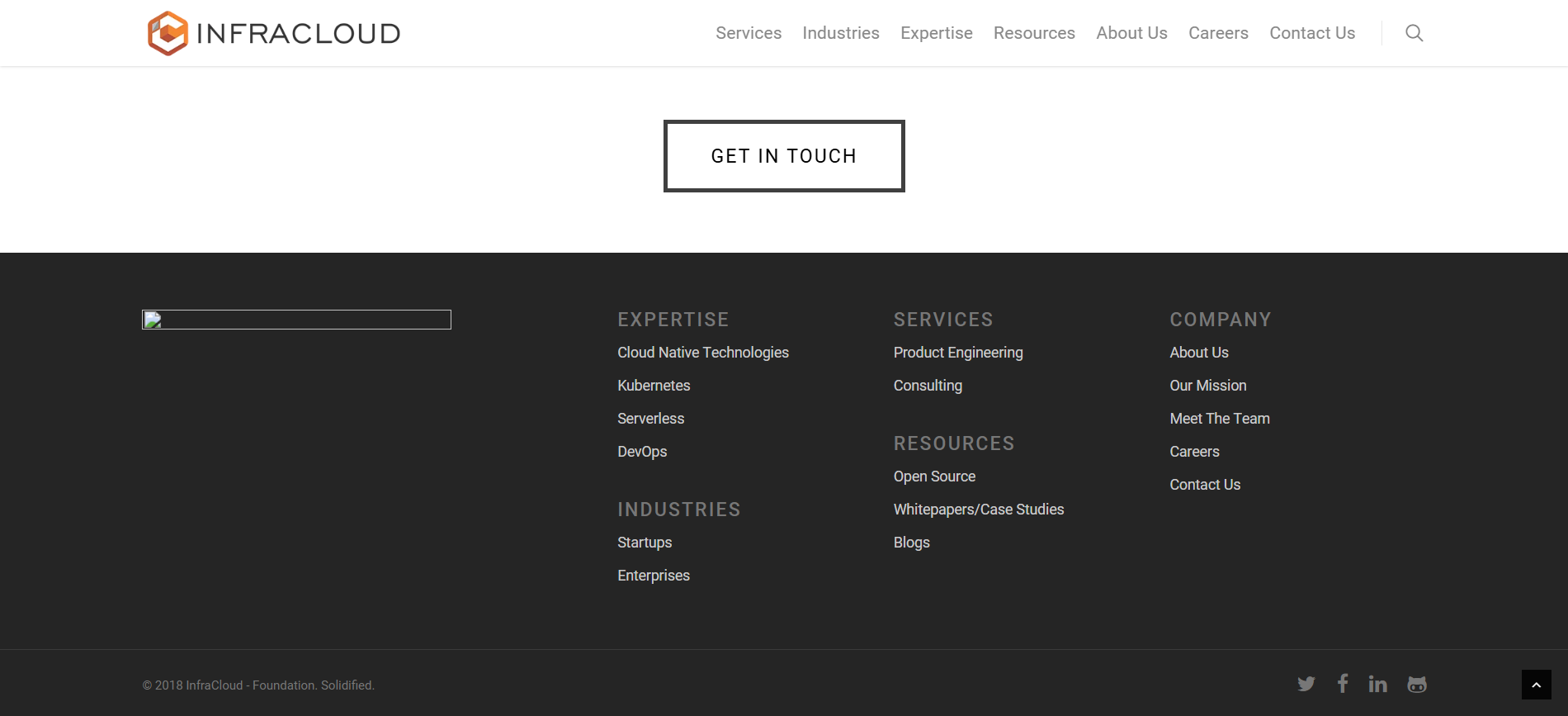
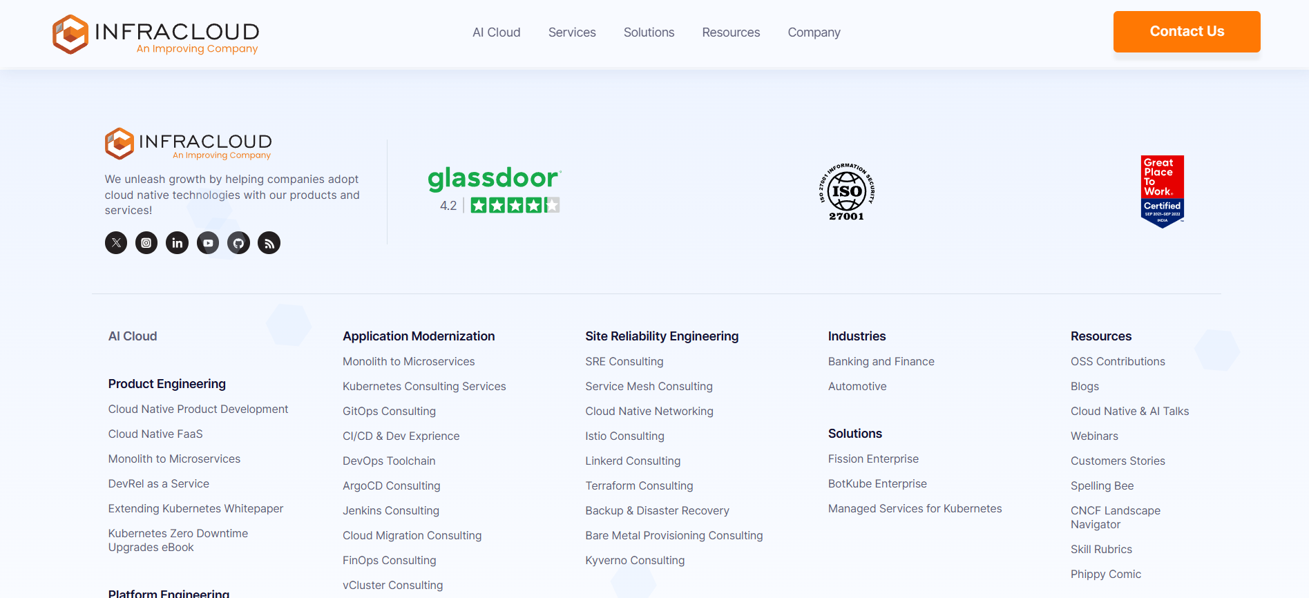
- IA improvement — the full service taxonomy exposed as a scannable map; any buyer can reach any offer from any page
- Trust improvement — third-party markers do enterprise due-diligence work before a salesperson is ever involved
Service Lines, Productized
The deepest structural change: generic "services" became named offerings with their own front doors, framed in the vocabulary technical buyers actually search — platform engineering, product engineering, cloud-native consulting. The clearest page-level evidence is the same offer, before and after:
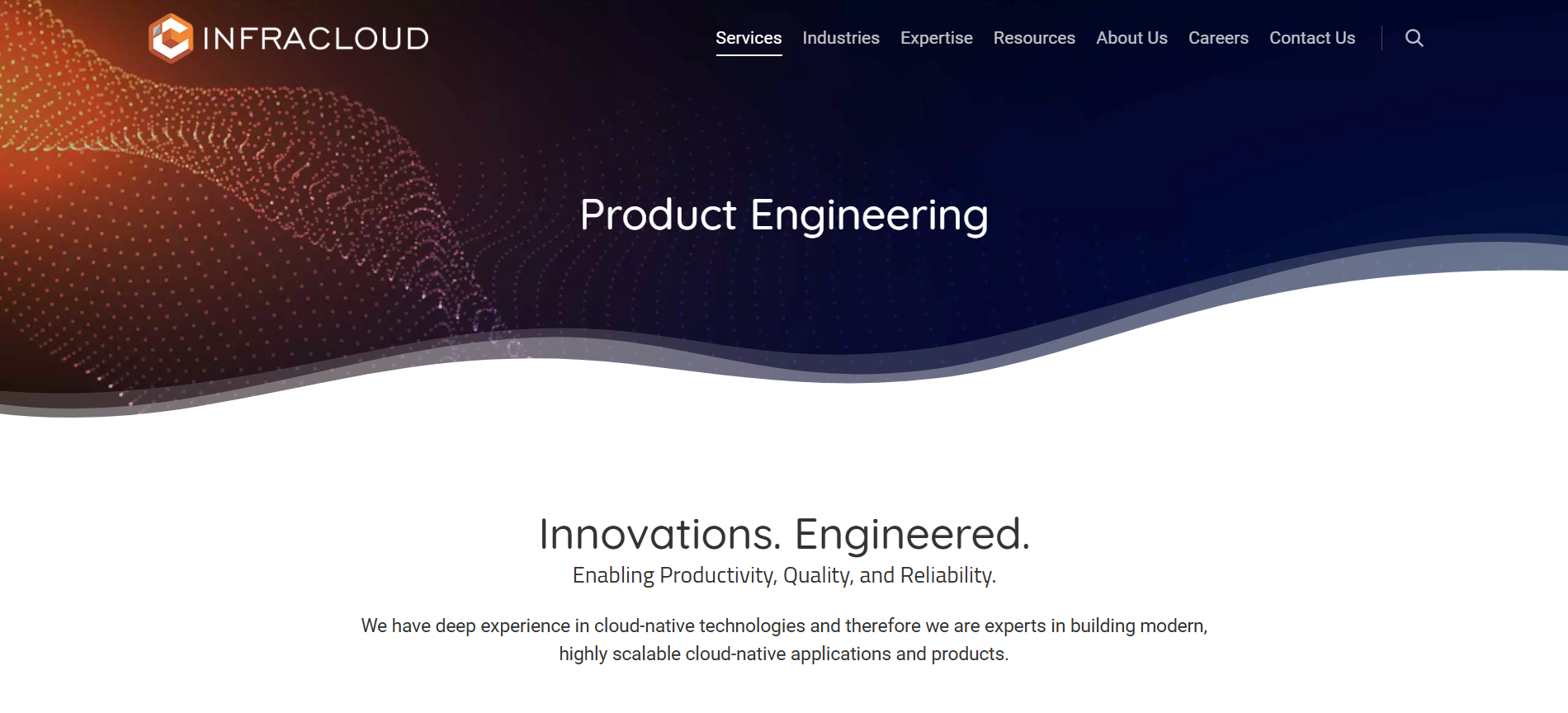
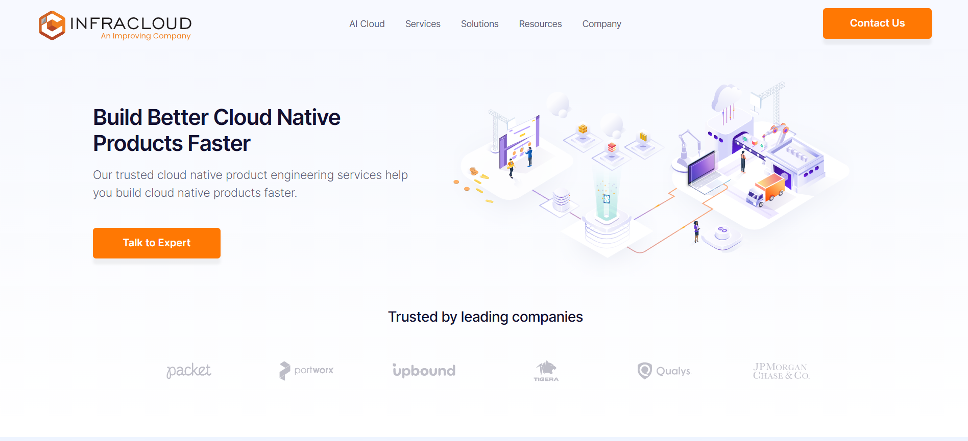
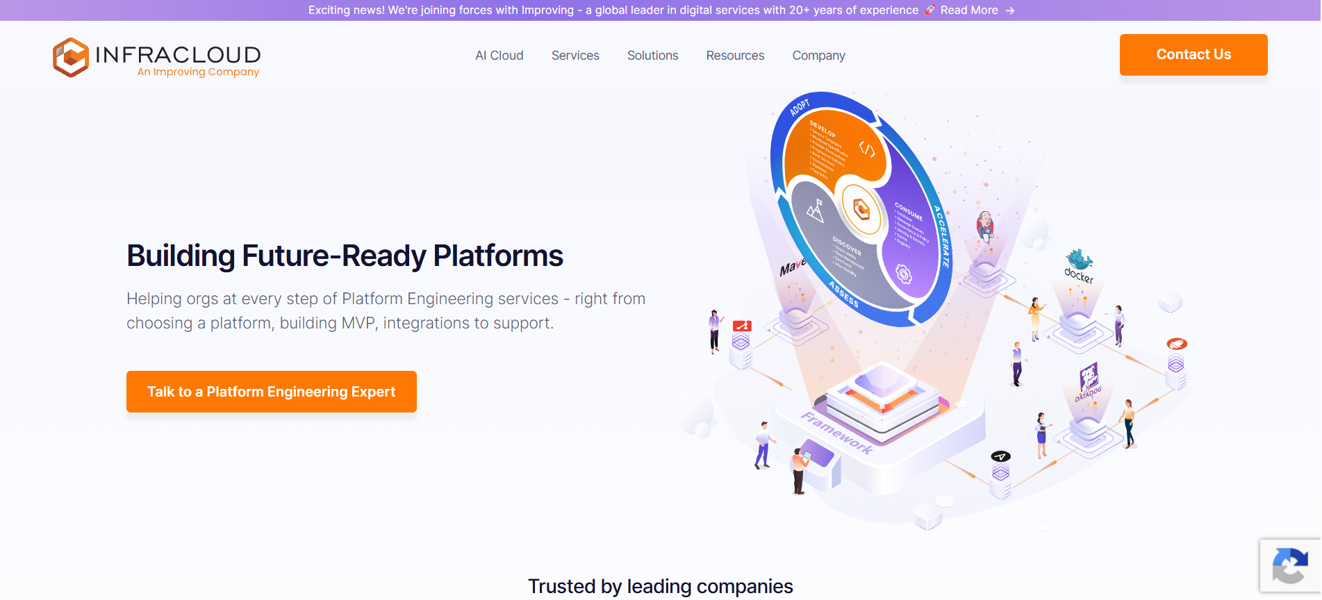
- Content hierarchy — each service line answers what / for whom / how / proof in that order
- Business reasoning — "build your product" and "build your platform" buyers carry different budgets; separate pages, undiluted pitches
- Positioning — named practice areas read like an established firm, not ad-hoc consulting capacity
Design Decision Log
The decision log below shows the choices that shaped the redesign. The important part was not making the site look newer; it was deciding what a technical buyer needed to see, in what order, and with how much evidence.
Engineers couldn't map the offering to their problem before losing patience.
DecisionRebuild the sitemap around buyer questions, not the org chart ReasoningThe funnel leaked at "service understanding" — an IA failure, not a visual one.
OutcomeAny buyer type reaches relevance in one or two clicks.
Real expertise was invisible; the site asserted quality instead of showing it.
DecisionPromote proof to first-class content — open source, blog, community ReasoningEngineers trust code and specifics more than adjectives.
OutcomeTechnical validation happens on-site instead of requiring a leap of faith.
Service pages read as marketing prose; technical readers skimmed and left.
DecisionStructure every service page for scanning: what / how / proof / CTA ReasoningThis audience reads in F-patterns and hunts for substance.
OutcomePages answer "is this for me?" in seconds, keeping buyers moving toward contact.
Reaching a human required hunting; pages dead-ended.
DecisionEnd every page with a purposeful next step ReasoningConversion friction compounds across a multi-page evaluation journey.
OutcomeContributed to the ~65% conversion improvement after launch.
One designer, many pages, years of future content — quality had to survive without me.
DecisionBuild the redesign on the reusable component library I maintained ReasoningMarketing needed to ship on-brand pages without a design bottleneck.
OutcomeNon-designers shipped consistent new pages for years — including service lines added after my tenure.
Constraints & Tradeoffs
- Technical constraints — the audience notices load times, so the visual system had to stay light: purposeful illustration over heavy media, performance treated as a credibility signal in its own right. The site also had to be maintainable by non-designers, which ruled out bespoke page layouts in favor of the component system.
- Business constraints — a services company's website is its pipeline; there was no "pause and relaunch." The redesign shipped on a live, lead-generating site, which forced an architecture-first sequence: IA and components before visual flourish, so every intermediate state still converted.
- Developer behaviour as a constraint — every persuasion pattern that works on consumer audiences (urgency, superlatives, gated content) actively backfires with engineers. The tradeoff accepted: a quieter site that reads slower to a marketer and faster to the buyer it's actually for.
- The core tradeoff — depth versus scannability on service pages. Full technical depth on-page would satisfy platform engineers and lose executives; pure summaries would do the reverse. The what/how/proof/CTA structure is the compromise: scannable altitude on the page, depth one click away in proof content.
Cross-Functional Collaboration & Engineering Validation
- With engineering — fully remote, async collaboration: annotated specs, component states, responsive rules; pixel-accurate implementation because the system left no ambiguity. Engineers also acted as the first credibility reviewers — if a page's technical claims made an internal engineer wince, it never shipped.
- With leadership and growth — the sitemap and page structures were agreed on flow diagrams before any UI, so debate happened at the cheap stage; post-launch, conversion was tracked by the growth team, which is where the ~65% figure comes from.
- With content owners — the component system was the collaboration mechanism itself: marketing shipped on-brand pages for years without design review, because the system encoded the decisions instead of me policing them.
Results
- ~65% improvement in conversion rate after launch (tracked post-launch by the growth team)
- The component-based build let non-designers ship consistent new pages for years after
- The IA absorbed new service lines added after my tenure without structural change — the clearest evidence the architecture was right
- Most-appreciated project on my Behance (100+ appreciations)
Reflection
Auto eCare — Automotive After-Sales Experience