
Case Study · Freelance · Automotive Aftersales
Auto eCare — designing a two-sided platform for automotive after-sales service
Designed a digital hub connecting vehicle owners and service providers, simplifying service discovery, scheduling, and vehicle history.

Context
Auto eCare is a two-sided digital platform for the automotive after-sales market. It connects vehicle owners who need service, maintenance, or repair with verified service providers, and gives both sides a shared, documented record of the vehicle's service history. I designed the product as a freelance engagement; autoecare.com is the live result.
The automotive after-sales space is fragmented by nature — owners deal with a mix of authorized dealers, independent garages, and roadside providers, with no consistent record of what work was done, when, or by whom. Auto eCare's premise is to give that fragmented relationship a single, transparent surface both sides can rely on.
The Problem
User problem
Vehicle owners have no single place to find a trustworthy provider, book a service, and keep a record of what was done — that history typically lives in paper receipts, memory, or scattered messages with a garage.
Business problem
Service providers have no easy way to reach new owners, build a reputation, or retain customers beyond a single visit — every job is a one-off transaction with no structured relationship afterward.
Ecosystem problem
The two sides had no shared source of truth. A platform that only served owners, or only served providers, would leave the other side exactly where it started — the product only works if both sides get enough value to stay active.
Users & Stakeholders
Auto eCare's own navigation and homepage structure draw a clean line between two primary groups — the product was designed around that split rather than a single generic audience.
- Find a trustworthy, nearby provider quickly
- Keep a documented service & maintenance history
- Get reminders before a service is overdue
- No consistent signal of provider quality
- Service records scattered across garages and memory
- No proactive reminders between visits
- Reach new local customers
- Retain existing customers between visits
- Run promotions without a marketing team
- Acquisition depends on foot traffic and referrals
- No structured way to stay in touch with past customers
- No easy documentation trail to build trust
- Sustain a two-sided marketplace where both sides get enough value to stay active — the site's closing pitch around digital presence, operational efficiency, and a low-commission model points to this as the underlying business model
My Role
This was a freelance product-design engagement. I designed the owner and provider experience across the live platform — the two-track information architecture, the core interaction flows, and how the five retention features are presented. Project-process records (team structure, timeline) aren't available for this engagement, so this case study focuses on the decisions visible in the shipped product.
- Information architecture for two distinct user journeys — owner and provider — inside one platform
- Interaction and screen design for the core owner and provider flows visible on the live site
- Feature framing for the five owner/provider-facing tools: service alerts, promotions, messaging, documentation, and provider search
Constraints & Challenges
- Two audiences, one platform — owners and providers have almost opposite goals (find vs. be found), and both had to feel native inside the same navigational shell
- Trust before transaction — neither side had an existing relationship with the platform, so credibility signals had to work before a single booking happened
- Feature breadth — five distinct tools (alerts, promotions, messaging, documentation, search) needed a shared visual language so the platform read as one product, not five bolted-on features
- A non-technical provider audience — service providers aren't necessarily software-native, so provider-facing tools had to stay approachable without becoming simplistic
Design Approach
Auto eCare had two audiences moving through the same product in opposite directions. Vehicle owners were looking for a trustworthy place to get a service done; providers were trying to be discovered and win repeat business. I treated that split as the starting point for the information architecture rather than trying to hide it behind one generic homepage.
The resulting product keeps two clear journeys inside one shared interface. Owners get a path built around finding and trusting a provider. Providers get a path built around being found, communicating their service, and staying connected with customers. The navigation, cards, sections, and calls to action use the same visual language across both sides, so the product still feels like one system.
Key Design Decisions
Owners and providers pursue opposite goals but need to coexist in one product.
DecisionSplit the homepage and navigation into two explicit tracks — "For Vehicle Owners" and "For Service Providers" ReasoningPutting both audiences into one undifferentiated homepage would make the page shorter, but it would also make the first interaction less relevant. I separated the two paths because the visitor already knows which side of the transaction they belong to. The interface should acknowledge that immediately.
OutcomeEach visitor can identify the relevant journey immediately instead of working it out from a shared set of generic messages.
Neither owners nor providers arrive with existing trust in the platform.
DecisionCenter a documented, shareable vehicle service history (E-Locker) as a first-class feature ReasoningReviews were the obvious marketplace pattern, but they would tell a visitor what someone thought about a service. E-Locker could show what actually happened to the vehicle. That distinction made a documented service history a stronger trust mechanism for this particular product.
OutcomeThe vehicle record becomes part of the trust model between owner and provider.
Five distinct tools risked feeling like five separate products bolted together.
DecisionGive every tool the same repeating pattern — icon, name, one-line value statement, supporting screen ReasoningThe five tools had different jobs, but introducing each one with a completely different pattern would make the product feel assembled feature by feature. I kept the presentation consistent so visitors could learn the pattern once and spend their attention understanding the feature itself.
OutcomeThe feature section reads as one product system rather than a collection of unrelated capabilities.
Provider-facing tools risked being too complex for a non-technical service-business audience.
DecisionFrame provider tools around plain business outcomes, not software terminology ReasoningProvider-facing features need to explain the business task before the software mechanism. A service business owner should understand what a feature helps them do without first learning product terminology.
OutcomeProvider-facing communication stays focused on the job the user is trying to run, rather than on the software vocabulary behind it.
Information Architecture — Two Tracks, One Shell
Vehicle owner track
Service provider track
Stakeholder Collaboration
The product balances three sets of requirements visible in its structure: owners need to find a provider they can trust, providers need to be found and retained without a marketing budget, and the platform itself needs both sides to keep showing up for the marketplace to work at all. Trust and acquisition pull in different directions — an owner-first design would build trust but starve providers of reach, and a provider-first design would help discovery but do nothing for retention. The two-track IA and the shared documentation feature (E-Locker) are the resolution: each side gets what it needs without crowding out the other's.
Final Solution
Screens in the order a first-time visitor actually hits them on autoecare.com.
Mobile App
The web platform is a desk-sized product — owners and providers both browsing, comparing, reading full profiles. Mobile has to answer a narrower, more urgent question: a car problem right now, a document needed on the spot, a provider to reach immediately. That difference shaped mobile as a task-first companion to the web platform, not a smaller copy of it.
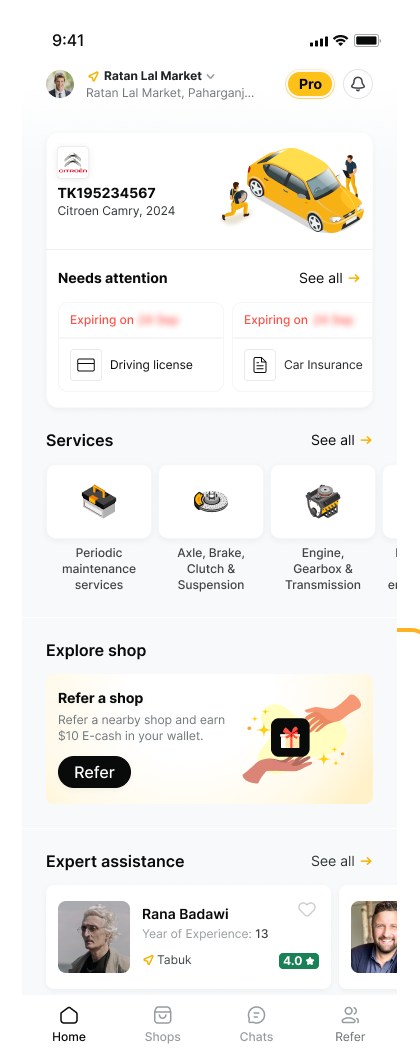
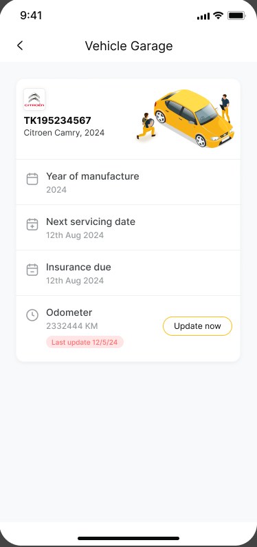
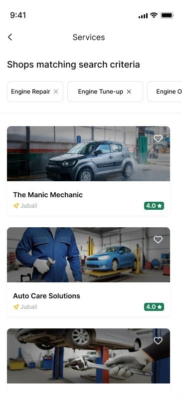
I designed the mobile experience shown here — onboarding and vehicle registration, the home dashboard, vehicle management, provider and expert discovery, in-app chat and calling, the E-Locker document flow, and the Pro membership upgrade. The screens available to me cover the vehicle-owner side of the product; I don't have a provider-facing mobile flow to show, so this section is scoped to owners (scope inferred from the available screens). The app is in active design and hasn't shipped — described here as designed work, not a launched product.
Mobile Design Decisions
The web platform's two-sided browsing model doesn't fit a moment when an owner needs help with their car right now.
DecisionBuild mobile as a task-first, owner-only app centered on one home dashboard ReasoningCarrying the provider side into mobile looks more complete on paper. In practice, a phone is where an owner is standing next to a broken car, not running a service business — so scope narrowed to that one urgent moment instead of chasing platform parity.
OutcomeThe home screen answers "what does my car need, and who can fix it" in one glance, instead of a menu to navigate first.
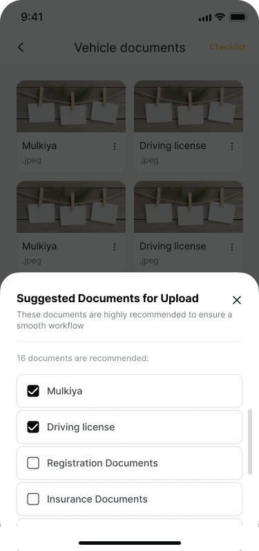
On web, E-Locker is one feature among several; on mobile, documents are often needed at the exact moment a job starts.
DecisionKeep E-Locker as a dedicated, top-level flow with a guided checklist of suggested documents, not a blank upload screen ReasoningA blank "upload a document" screen asks less of the design, but it leaves an owner guessing what's actually required. A suggested-documents checklist turns a vague task into one they can actually finish.
OutcomeDocument upload becomes a short, guided task — carrying the web platform's "documentation as trust" idea into the moment mobile owners actually need it.
Reaching a provider or expert on web happens through browsing and a contact form; mobile needs something faster.
DecisionBuild chat, voice, and video calling directly into the provider/expert profile, with photo and document sharing in the same thread ReasoningA generic contact form would match the web pattern, but an owner standing next to their car is better served by sending a photo of the problem directly than by filling out a form and waiting for a reply.
OutcomeThe distance between "I found a provider" and "I'm talking to them" collapses to one tap, with visual context carried into the conversation itself.
Selected App Screens
The owner's home base, and the two moments that matter most once something needs attention: managing the vehicle, and proving its history.
Outcome
Verified outcomes
The web platform is live and shipped; the mobile app is still in active design and hasn't launched. Usage and conversion figures aren't available to me for either.
Design impact — qualitative
- A single navigational shell serves two audiences with opposite goals without feeling generic to either
- A documented vehicle history gives both sides a persistent trust artifact instead of a one-time transaction
- A repeatable feature-card pattern lets the platform keep adding owner/provider tools without fragmenting its visual language
- The mobile app carries the same trust mechanism (E-Locker) and product identity into a task-first, owner-focused experience, rather than treating mobile as an afterthought of the web platform
Reflection
What I'd improve next: I'd want to validate whether owners trust the documentation record on its own, or whether a lightweight reputation signal at the point of discovery would move the trust decision earlier — before a booking, not after one.
R2R — Right to Repair Digital Ecosystem