
Case Study · Freelance · Consumer Service Platform
HomeLink eCare — designing remote home-care coordination people can actually trust
Designed a platform for managing home services — from a leaky faucet to a full relocation — for homeowners who can't be physically present to manage the property, with verified providers and a documented trail from booking to completion.

Context
HomeLink eCare is a platform for coordinating home services — repairs, relocation help, utility setup, and more — for homeowners who can't be on-site to manage them directly. The live product frames the alternative explicitly as "the informal way": scattered messages, unclear ownership, and no record of what was agreed or done. HomeLink's premise is to replace that informality with a structured, accountable process. I designed the product as a freelance engagement; the live UAT build is the result.
The Problem
User problem
Homeowners managing a property remotely have no reliable way to find a vetted local provider, agree on scope, and confirm the work was actually done — most of that today happens over ad hoc messages with no record.
Business problem
Without a structured booking-to-completion flow, every job is a one-off, unverifiable exchange — bad for the homeowner's peace of mind, and just as bad for a legitimate provider's ability to build a reputation.
Ecosystem problem
Trust has to work in both directions at once: homeowners need confidence in providers they've never met, and providers need a channel that doesn't depend on geographic proximity or a personal referral to find work.
Users & Stakeholders
The live product's own feature set — provider screening, community endorsement, documented records — points to three groups the platform designs trust around.
- Find a trustworthy local provider without being on-site
- Keep a documented record of what was requested, agreed, and completed
- Get status updates without having to chase them
- No visibility into a provider's reliability before hiring
- Communication scattered across calls and texts
- No proof of completion after the fact
- Get discovered by homeowners outside an existing referral network
- Build a credible track record inside the platform
- Reputation currently lives outside any system they control
- No structured way to document completed work as proof for future customers
- The platform explicitly frames providers as "community-verified" — vetted and endorsed by community members and past clients, a lightweight social-trust layer rather than a formal review board
My Role
This was a freelance product-design engagement. I designed the end-to-end homeowner and provider experience on the live UAT build — the trust framing, the four-step booking flow, and the accountability system that runs through it. Team composition and delivery timeline aren't documented for this engagement, so this case study is built from what's verifiable in the product itself.
Constraints & Challenges
- Trust at a distance — the entire premise is that the homeowner can't be there to verify anything in person, so every trust signal had to live in the interface itself
- Two-sided accountability — the platform had to protect the homeowner (proof of work) and the provider (proof of scope and payment) at the same time, not just one side
- A wide service category range — from a leaky faucet to a full relocation, the same booking flow had to stay legible across very different job types
- Low tolerance for ambiguity — a homeowner managing a property remotely is often already anxious; unclear status or a missing confirmation reads as a bigger failure here than in a low-stakes consumer app
Design Approach
HomeLink starts with a problem that a normal service marketplace does not have: the homeowner may not be anywhere near the property when the work happens. A missing update or unclear confirmation therefore carries more weight than it would in an ordinary consumer booking flow.
I designed the service around the points where that uncertainty is most likely to appear. First, the homeowner needs enough information to choose a credible provider. Then the scope and agreement need to be explicit. Finally, the service needs to leave a record that can be checked after the work is finished.
The provider side follows the same principle from the other direction. Providers need to know what they have agreed to do, communicate clearly during the job, and build a history that can support future work.
Trust here is not a badge added to the interface. It comes from making the service itself more traceable.
The service has to answer three practical questions
- Can I trust the provider? — The homeowner needs enough information to make a decision without being physically present.
- Do we agree on the work? — Scope, agreement, and expectations need to be explicit before the job begins.
- Can I verify what happened? — The service should leave a record that can be checked after the work is complete.
Key Design Decisions
The decisions below came from the same question throughout: what would make a remote homeowner feel that the service is under control, even when they cannot be there themselves?
The existing "informal way" — scattered messages, unclear ownership — was the actual competitor, not another app.
DecisionOpen the product by explicitly contrasting "the informal way" against "the structured way," side by side ReasoningThe competing experience was often a message thread, a phone call, or an informal arrangement. That matters because a feature list does not explain why the product is necessary. I made the structured alternative visible first so the visitor could understand the problem before evaluating the features.
OutcomeThe value proposition is understandable before a visitor sees a single feature screen.
Homeowners have no way to verify a provider they've never met, from a distance.
DecisionMake provider screening a named, visible step in the flow, not a background policy ReasoningDistance changes the threshold for trust. A homeowner cannot simply meet the provider before deciding. Making screening visible in the flow gives that missing step a place in the product instead of leaving it as an invisible promise.
OutcomeProvider credibility becomes something the homeowner can see, not something they have to take on faith.
Work happening out of sight — by definition, the homeowner is remote — creates a natural verification gap.
DecisionBuild a documented, step-based record — discovery, agreement, confirmation, completion — as a persistent trail ReasoningA remote homeowner's real question isn't "is it done?" but "can I trust that it's done?" — a documented trail answers that with evidence, not a status label.
OutcomeCompletion carries a visible record instead of resting on the provider's word.
53+ services spanning auto, relocation, tech, and property risked feeling like an unstructured directory.
DecisionGroup services into a small number of clear categories instead of a flat list ReasoningCategorizing means a homeowner has to correctly guess which bucket their need falls into — a real cost when a job spans two categories — but weighed against scanning 53+ items for a matching keyword, recognizing a category in one glance was the better bet for most situations.
OutcomeBreadth of service coverage reads as organized capability, not clutter.
Trust needed to be built into the system, not asserted once in marketing copy.
DecisionBreak "accountability" into six distinct, individually named mechanisms rather than one generic trust statement ReasoningA single "trust & safety" banner is less to design and less to read — and it answers no specific question. Six nameable mechanisms cost more space but read as more credible, each answering a different version of "what if something goes wrong?"
OutcomeTrust is demonstrated as a system of concrete safeguards rather than claimed as a feeling.
Information Architecture — The Booking Flow
The product's own step labels map directly onto the core user journey:
Stakeholder Collaboration
Three relationships have to hold at once for this product to work: homeowners need confidence in a provider they've never met; providers need a channel to reach homeowners without a personal referral; and community verification needs to feel like a credible middle ground rather than either side's self-reporting. The design resolves this by giving verification, scope, status, and documentation each their own visible surface in the flow, rather than folding all of it into one generic "trust and safety" statement.
Final Solution
The homepage top to bottom, in the sequence a first-time visitor experiences it.
Mobile App
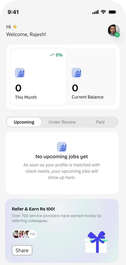
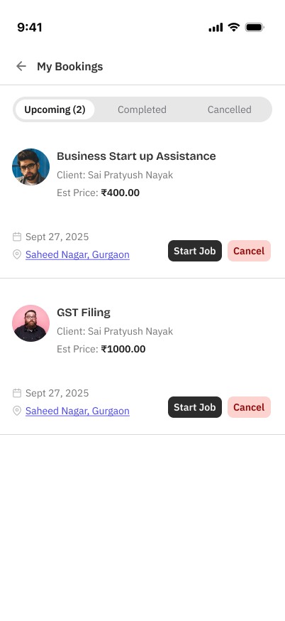
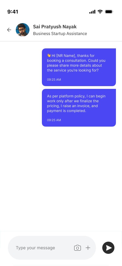
The web platform (above) is framed around the homeowner booking a service. The mobile app is the other half of that transaction: the service provider (SP) who has to get verified, respond to work, and get paid — mostly standing up, between jobs, on a phone. I designed the SP-facing app shown here: the dashboard, booking and job-lifecycle management, and the quotation/chat flow. It's in active design and hasn't launched.
Research
This app was built on fieldwork, not assumption: 8 face-to-face interviews with service providers across 3 service categories in Bhubaneswar, plus a competitive review of UrbanClap/Urban Company, Sulekha, and JustDial. The competitive review found a specific, unclaimed position — no existing platform combined moderate commission, verification-based trust, a direct line to the homeowner, and transparent payment.
One persona built from the interviews, Kavita Reddy — an elderly-care provider with 8 years of experience and low-to-medium tech comfort — put the core tension in her own words: "I know how to care for elderly people... But finding new families is hard. I only get calls when someone knows me. If they don't know me, they won't trust me."
Key Research Insights
Four patterns from the interviews shaped most of what follows.
- A clear, itemized document checklist
- An in-app camera with auto-crop, not a generic file picker
- A visible status: submitted → under review → verified
- Notifications carrying real booking context, not "you have a message"
- A direct tap from notification into the booking, no detour screens
- A quotation builder instead of a blank message field
- Pre-chat questions before open conversation starts
- A visible payment stage on every job
- The payment policy stated up front, not negotiated case by case
Product Requirements
The interviews and a separate environment profile (how and where SPs actually use a phone during the day) translated into concrete requirements, not just design principles:
- Verification has to be legible, not just possible — a checklist and a status an SP can point to, not a black box
- Booking responses have to be fast — the business's own target was 60%+ of bookings getting an SP response within 2 hours, which meant notifications had to carry enough context to act on immediately
- Every interaction has to tolerate interruption — the environment research found on-the-go use in 62.5% of check-ins, with constant client-call interruptions; tasks needed to be scannable in short bursts and safely resumable, not multi-step flows that punish being interrupted
- Data and attention are both scarce — most SPs run 1–2GB/month data plans and prefer text and images over video, and 62.5% lean on family members for anything technically unfamiliar — so the interface had to stay light and self-explanatory
Design Journey
Mobile Design Decisions
Research found that SPs like Kavita need communication scaffolding, not an open-ended chat box — a blank message field is a blank-page problem for someone who isn't a natural salesperson.
DecisionPre-fill the opening message and surface a "Send quotation" action directly in the chat list, instead of an empty conversation ReasoningAn open chat gives more flexibility, but it forces every SP to improvise a pitch from scratch, every time. A structured opening does that work once, in the design, so the SP doesn't have to redo it under pressure with every new lead.
OutcomeSending a quotation becomes a repeatable, low-effort action instead of a blank-page problem.
Payment uncertainty was the second-most-cited pain point (7 of 8 interviews) — "when will I get paid?"
DecisionState the payment policy in the first automated message of every conversation — work begins only after pricing is finalized and payment is confirmed ReasoningLeaving payment terms to be negotiated case-by-case would feel more flexible, but it's exactly the ambiguity the research identified as the adoption blocker. Saying it up front, every time, costs nothing and removes the awkward-to-ask moment entirely.
OutcomePayment expectations are set before either side has invested time, not negotiated awkwardly mid-job.
An SP's income depends on a steady booking pipeline; a careless decline has a real cost the interface doesn't otherwise show.
DecisionRequire a confirmation step to decline a job, stating the consequence — the client can't reach you again, and it affects your response rate ReasoningA single-tap decline would be faster, but for someone whose livelihood depends on inquiries, an accidental or impulsive decline is expensive. Making the cost visible before the action completes is worth the extra tap.
OutcomeDeclining a job becomes a deliberate choice instead of an accidental one.
The environment research found most app use happens in short, interrupted bursts — 2–3 minutes during the day, checked between client calls — not focused sessions.
DecisionLead the dashboard with scannable status — earnings this month, current balance, and Upcoming/Under Review/Paid tabs — instead of a detailed activity feed ReasoningA richer, narrative dashboard would show more context per visit, but the research showed that context is rarely what a 2–3 minute check actually needs. The job is to answer "where do things stand" instantly, not to be read like a report.
OutcomeAn SP can check status and get back to work inside the short windows the research found were actually available.
Selected App Screens
The SP's day, in the order it actually happens: check earnings and status, manage bookings, send a quotation.
Outcome
Verified outcomes
The web platform is live and in production (UAT); the SP mobile app is still in active design and hasn't launched. Bookings, retention, and provider-adoption numbers aren't available to me for either.
Design impact — qualitative
- The "informal vs. structured" framing gives the product an immediate, self-evident reason to exist
- Six named accountability mechanisms make trust legible instead of asserted
- Category-first service browsing keeps a 53+ item catalog from reading as clutter
- The SP mobile app translates specific, documented research findings — trust, communication scaffolding, payment transparency — directly into interface decisions, extending the platform's accountability story to the people delivering the service
Reflection
What I'd improve next: test whether the six accountability mechanisms are read individually or blur into one generic "trust" impression at a glance — that's a hierarchy question worth validating with real users, which this engagement didn't include.
FusionCharts — Data Visualization for Developer Teams