
Case Study · Developer Tools · Data Visualization
FusionCharts — designing data visualization experiences for developer teams
Foundational product-design experience in data visualization, developer-facing UI, documentation, and marketing at FusionCharts — work that shaped how I approach dashboards, dense information, and technical audiences today.
Context
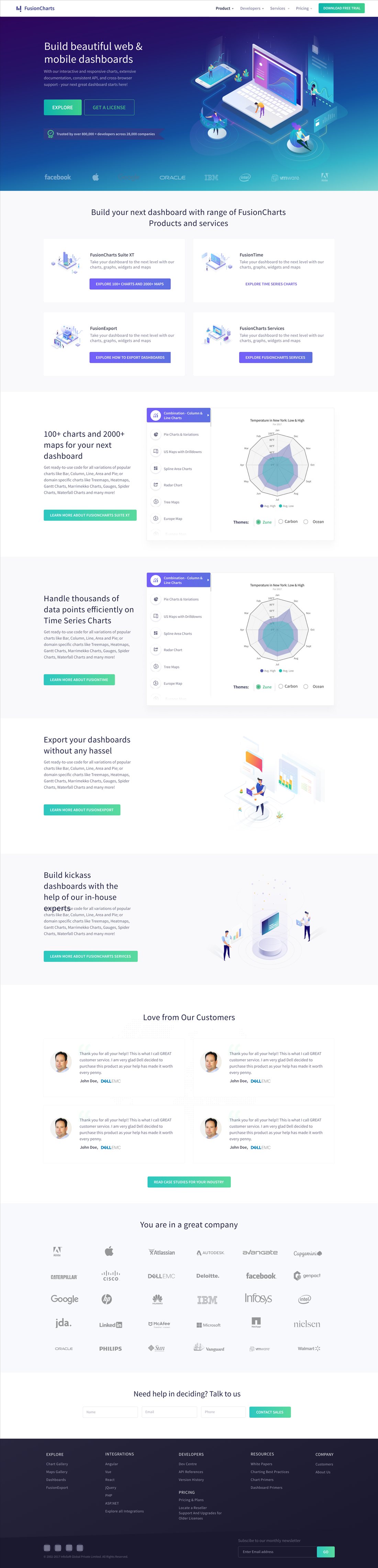
FusionCharts is a JavaScript data-visualization product — a charting and mapping library, plus the tooling around it (export, time-series charts, ready-made dashboards) — used by thousands of developer teams to build charts, maps, and dashboards into their own products. I worked there as Senior Visual & UI Designer from 2016 to 2020, across product UI, documentation, and marketing.
The screens in this case study are from that period. FusionCharts has since changed ownership and its product and website have evolved well beyond this work — what follows documents what I designed then, grounded in the shipped screens and the scope already recorded in my resume, not a reconstructed process.
The Problem
Product problem
The product's actual capability is broad and technically deep — 150+ charts, 1,000+ maps, multiple front-end and back-end integrations, and a library of ready-made business dashboards. Presented flatly, that breadth reads as a feature dump rather than a coherent product.
User/communication problem
The audience is developers evaluating a library, not readers of marketing copy — they need to be convinced quickly, with evidence, without the site pretending the underlying technology is simpler than it is.
Business problem
The same site also has to reassure a less technical stakeholder — someone signing off on the purchase, not writing the integration code — that this is a credible, enterprise-safe choice.
Users & Stakeholders
The site's own structure points to distinct audiences with different evidence needs.
- Understand chart/map coverage quickly
- See real integration paths for their stack
- Get from "interested" to "trying it" fast
- Live, interactive chart examples over feature lists
- Named framework integrations, not generic claims
- Find a ready-made dashboard close to their use case
- Confirm source code is actually available, not just a demo
- Named, industry-specific dashboard examples (energy, weather)
- The enterprise logo wall and customer-success messaging address someone evaluating vendor credibility, not integration code — likely a buyer or manager alongside the developer evaluator
My Role
My work at FusionCharts covered product UI, documentation, and marketing for a developer-focused data-visualization product. The experience was less about one isolated redesign and more about repeatedly solving the same class of problem: how to make complex information understandable without stripping away the detail technical users needed.
My role included
- Product UI and interface design
- Documentation and developer-facing content
- Marketing and web design
- Visual systems for data-heavy product surfaces
Constraints & Challenges
- Technical breadth vs. first impression — 150+ charts and 1,000+ maps had to feel like capability, not clutter, on a first visit
- Two audiences, one page — a skeptical developer and a non-technical buyer needed different evidence from the same homepage
- Documentation had to do two jobs — fast enough for a five-minute evaluation, deep enough for actual implementation
- A wide integration surface — ten-plus front-end and back-end frameworks needed a scannable presentation, not a long list
Design Approach
Data visualization changes the design problem. The interface cannot simply look clean; it has to preserve relationships between values, labels, controls, and context while still giving the user a clear place to start.
My work during this period built the foundation for the dashboard and data-density specialization I carry into later product work. I worked across product surfaces, documentation, and marketing, which meant the same visual and information principles had to hold across very different contexts.
Information Architecture
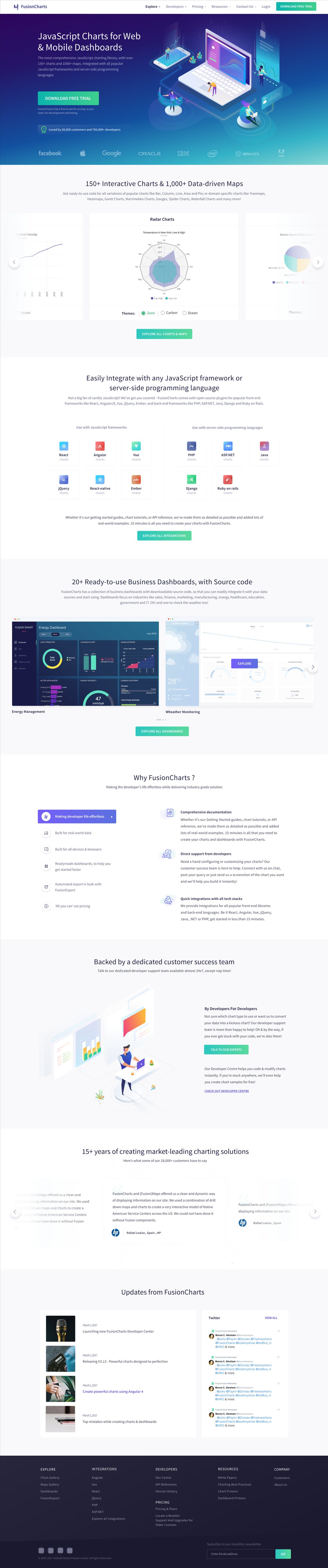
The homepage's own section order is the clearest evidence of the intended hierarchy:
Every step moves a visitor from "what is this?" toward "can I use this, and do I trust it?" — a developer skimming for integration paths and a buyer skimming for logos can both stop at the section that answers their question.
Key Design Decisions
The following decisions are reconstructed only where the surviving product structure or project material supports them. They should be read as evidence of the kind of design problem I worked with during this period, not as a claim that every historical requirement or meeting note survives.
A charting library's real value is abstract until someone sees it solve their problem.
DecisionLead with the product outcome, not the implementation ReasoningA technically precise opening ("a JavaScript charting API") would speak directly to an experienced developer, but it raises the bar for anyone evaluating the platform at a higher level first. Opening on the outcome — beautiful dashboards, built fast — costs a little technical precision up front in exchange for a wider first-scroll audience.
OutcomeThe hero states value before implementation, so both a developer and a less technical evaluator can tell in seconds whether to keep reading.
Feature lists don't prove a charting library actually renders well.
DecisionShow a live, interactive chart directly in the capability section instead of only describing chart types ReasoningA static screenshot is cheaper to produce and maintain. But a developer evaluating a rendering library is really asking "does this look good and behave well" — only a working example answers that.
OutcomeCapability is demonstrated, not just claimed.
A single company selling charts, maps, time-series tooling, export, and services risks reading as an unsorted feature dump.
DecisionSplit the ecosystem into named product cards — Suite XT, FusionTime, FusionExport, FusionCharts Services ReasoningOne combined product page takes less work to build, but it forces every visitor through content meant for a different need. Named categories let a visitor self-sort in seconds instead.
OutcomeThe broad product family reads as organized capability instead of clutter.
The homepage has to satisfy a skeptical developer and a non-technical buyer at once, and neither audience should feel like an afterthought.
DecisionPair the technical integration grid with a conventional enterprise trust section — customer logos, testimonials, "years in the market" ReasoningA page built only for developers would under-serve the buyer who's signing off, and a page built only around trust signals would read as content-free to an engineer. Running both in parallel costs some visual focus but serves both readers in one scroll.
OutcomeTechnical credibility and enterprise credibility sit on the same page without either one diluting the other.
Claiming dashboards are "ready to use" is a common, low-trust marketing line.
DecisionShow named, industry-specific dashboard examples (Energy Management, Weather Monitoring) with source code, not a generic promise ReasoningA generic "20+ dashboards" counter is easier to produce. Specificity — real industries, real screens — is what actually makes a "ready to use" claim believable to someone who's heard that claim fail before.
OutcomeThe dashboard section functions as proof rather than promotion.
Product cards, dashboard examples, and integration tiles each could have earned their own custom treatment, since they're technically different kinds of content.
DecisionReuse one card pattern — icon, name, one-line description, action — across product categories, dashboards, and integrations ReasoningCustom-styling each content type would make every section look purpose-built. It also means a visitor has to re-learn how to read the page every time the content changes. One repeating pattern gives up that novelty for a system a visitor recognizes on sight after the first card.
OutcomeProduct cards, dashboard cards, and integration tiles all read as the same family — reinforcing that this is one coherent product, not a bundle of loosely related tools.
Stakeholder & Product Requirements
Beyond individual users, the page has to satisfy a set of product-level requirements at once — none of them documented as a formal brief, all of them visible in what the shipped homepage actually does:
- Developers need technical credibility — named framework integrations and a live chart demo, not adjectives
- Evaluators need product value fast — the outcome-led hero answers "what is this for" before any implementation detail
- Teams need to see the integration surface before committing — the framework grid exists so that question gets answered without a support ticket
- Dashboard-focused visitors need realistic examples, not a promise — named, industry-specific dashboards stand in for a generic "ready-to-use" claim
These are requirements read back out of the shipped product itself, not minutes from a requirements meeting.
Final Solution
The product ecosystem, in the order a first-time visitor actually scrolls through it.
Outcome
Verified outcomes
This work is represented by the shipped screens shown above. No conversion, traffic, or engagement metrics from this 2016–2020 engagement are available to me now, so none are claimed here.
Design impact — qualitative
- A broad, technically deep product family is organized into a hierarchy a first-time visitor can navigate without a guide
- Developer and buyer audiences are both served on the same homepage without either reading as an afterthought
- This engagement became the foundation of my ongoing specialization in dashboard design and data visualization, carried forward into every later role
Reflection
What I'd improve next: I'd want to validate whether a developer can move from the high-level product story to the exact chart type, integration, or documentation page they need without unnecessary navigation — that's the kind of path-efficiency question that needs usage data this project doesn't give me visibility into now.
Testsigma — Conversion-Focused Web Templates