
Supporting Project · Published on Figma Community
Design System for Figma Portfolio
A reusable design system built and published in public — the foundations layer (type, layout, patterns) packaged so any designer can build a coherent portfolio on top of it.
Why it exists
A portfolio is a small product with a real design problem: dozens of pages that must feel like one system, built by a person who would rather be doing the work than formatting it. I built this system to solve that problem once — and published it to Figma Community so others could build on it too.
What the system covers
- Design foundations — a defined color logic, spacing scale, and elevation rules that every layout inherits
- Typography system — a fixed set of text levels (display through caption) so hierarchy is a decision made once, not per page
- Layout frameworks — grid-based page templates for covers, case-study sections, dividers, and galleries that compose without redesign
- Reusable patterns — cards, media frames, list structures, and section blocks built with Figma auto layout for painless reuse
- Usage guidance — the file is organized to be understood by a stranger, because on Community, every user is one
Explore the live file for the full structure: Design System for Figma Portfolio on Figma Community →
How the System Is Run
A published system lives or dies on its operating model, not its component count. The choices here, scaled to what a Community-distributed system honestly is:
- Adoption strategy — adoption is designed for the coldest possible start: a stranger opening the file with zero context. Familiar naming, self-evident organization, and working defaults mean the first page built with the system is built in minutes — because a system nobody adopts is a document, not a system.
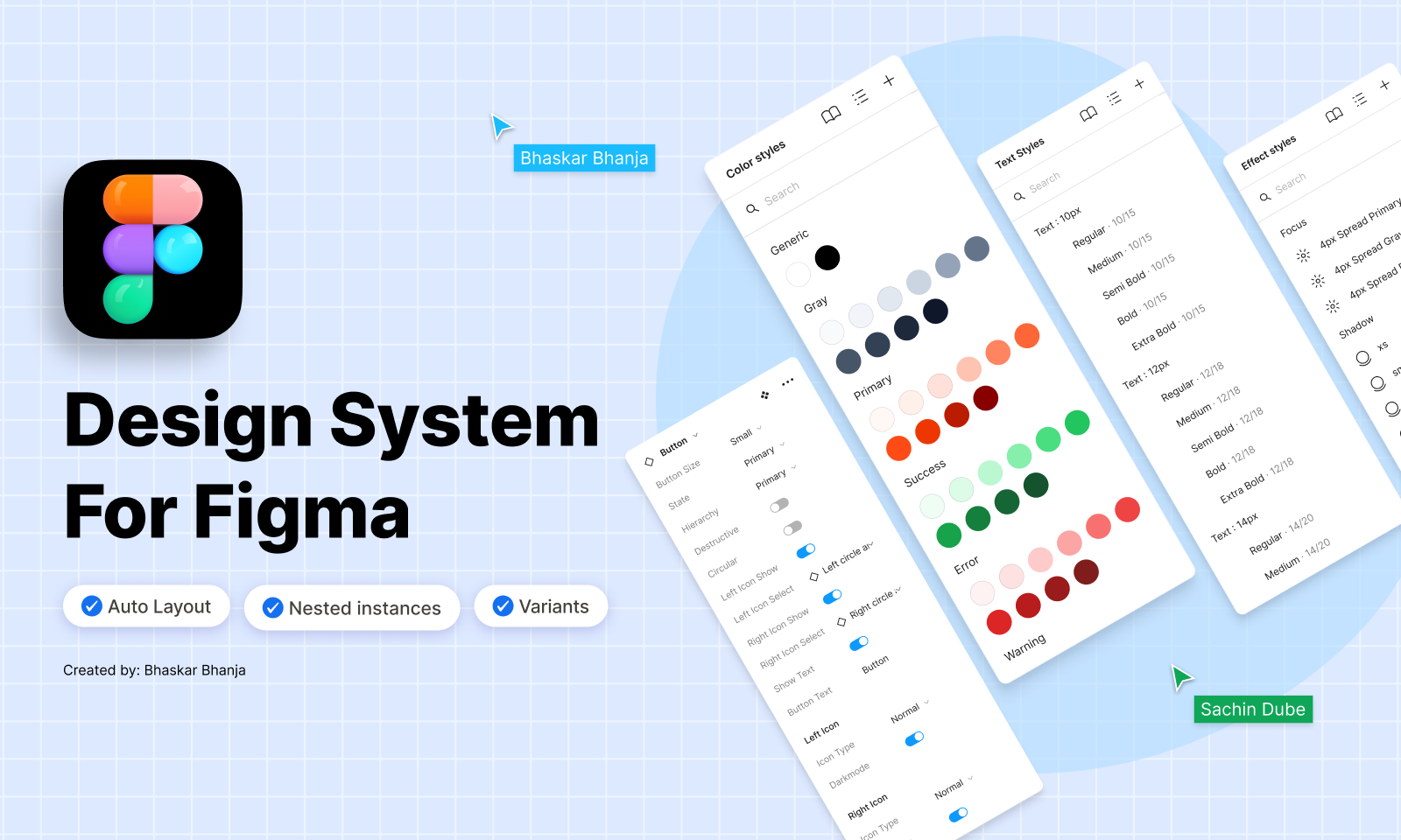
- Design tokens — color, text, and effect styles are the token layer (visible on the cover): every component references styles, never raw values, so a palette or type change propagates in one edit instead of a hunt.
- Governance — one source file, one owner, documented usage guidance in place of a review committee. At this scale, governance means the file itself makes wrong usage harder than right usage — constraints encoded in variants and auto layout, not enforced in meetings.
- Versioning — changes ship as Community updates with the discipline that implies: additive where possible, breaking changes made obvious, existing user files never silently invalidated.
- Contribution & extension — Community users extend by duplication, so the structure is the contribution process: consistent component anatomy and naming mean an extension built by a stranger still looks like it belongs.
- Engineering-shaped thinking — properties and variants mirror how a developer would model the same components (state, size, hierarchy as props), a habit carried from years of handoff work — and the reason design-to-code translation stays mechanical.
- How consistency scales — the same mechanism as my enterprise work, at portfolio scale: decisions made once at the foundation level, inherited everywhere, so the tenth page costs less than the first instead of more.
What it demonstrates
- Foundations before screens — the same sequencing I use on product work: type, spacing, and layout logic defined before a single page is composed.
- Patterns that scale — a small set of well-built blocks covers a large space of page needs; that ratio is the whole craft of systems work.
- Documentation as design — a published system is judged by whether strangers can use it without asking questions.
- Working in public — shipping to Figma Community means real users, real feedback, and no hiding behind process theater.